Pharmasons

CLIENT
Pharmasons
INDUSTRY
Health & Supplement
Pharmasons
INDUSTRY
Health & Supplement
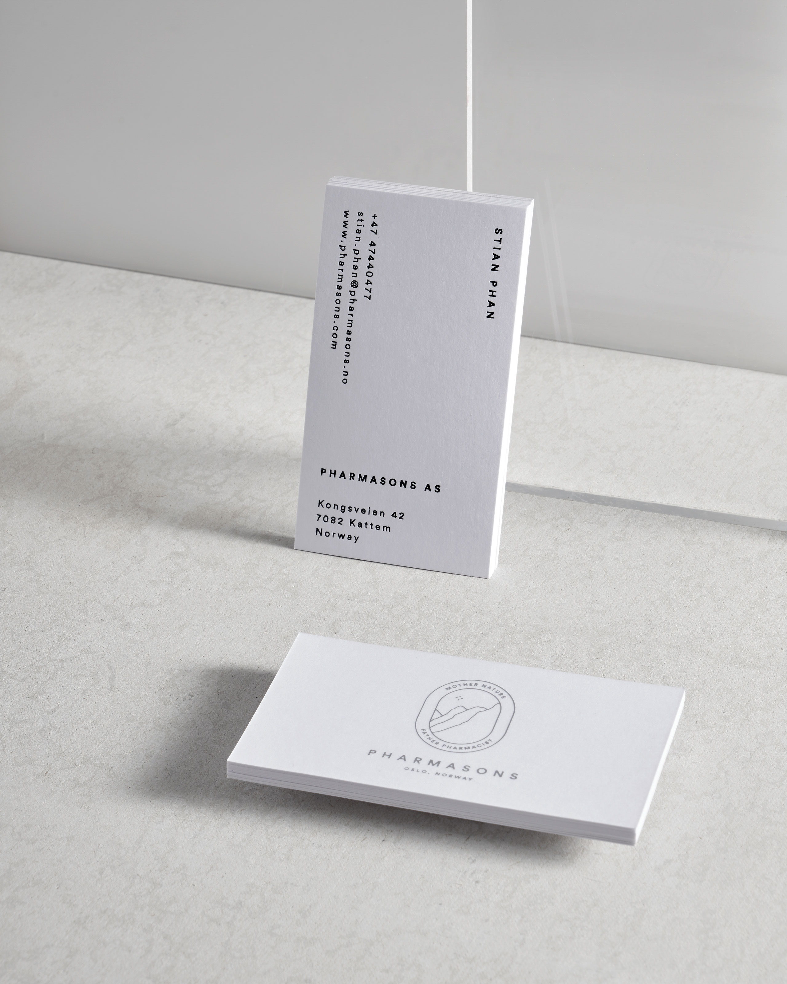
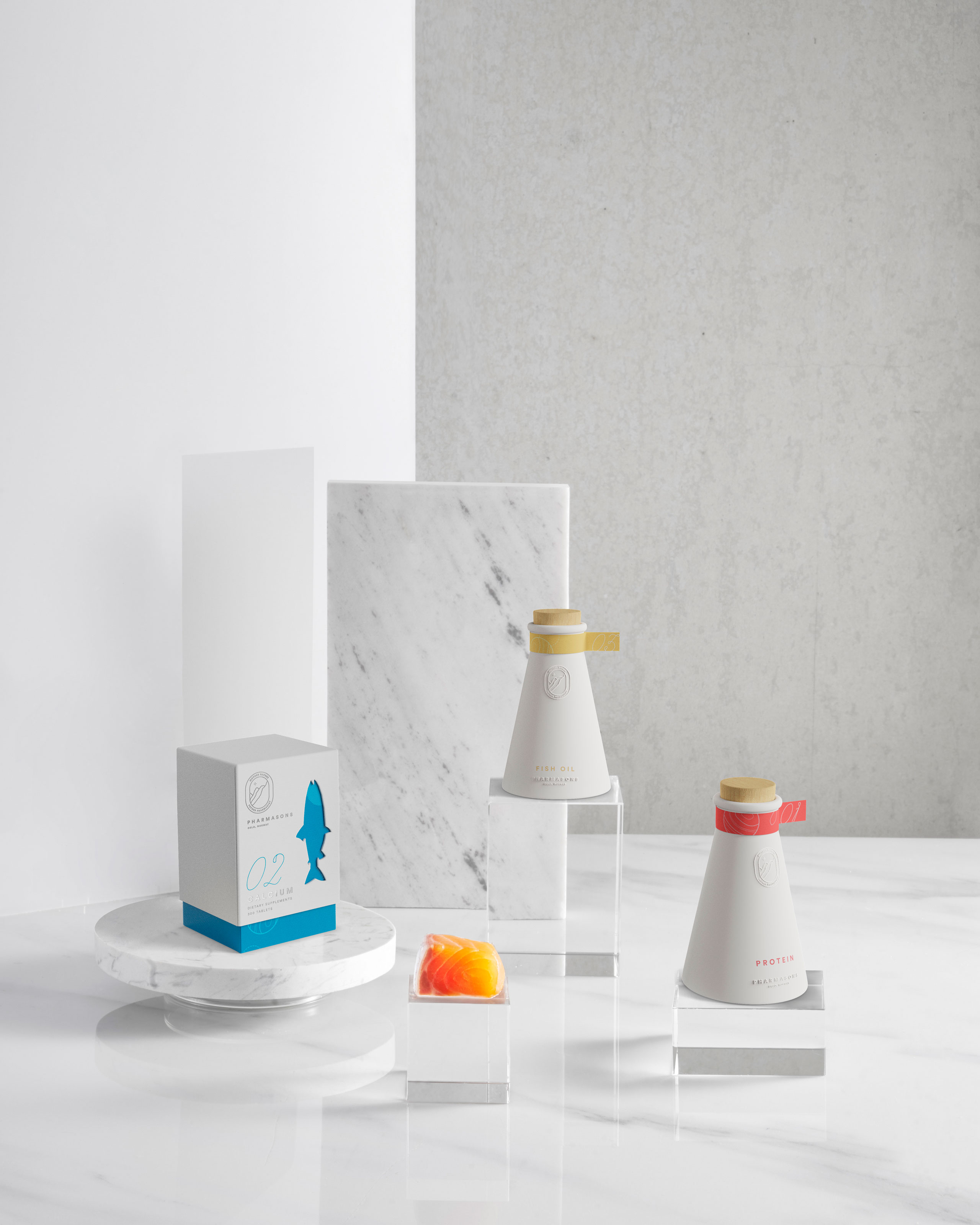
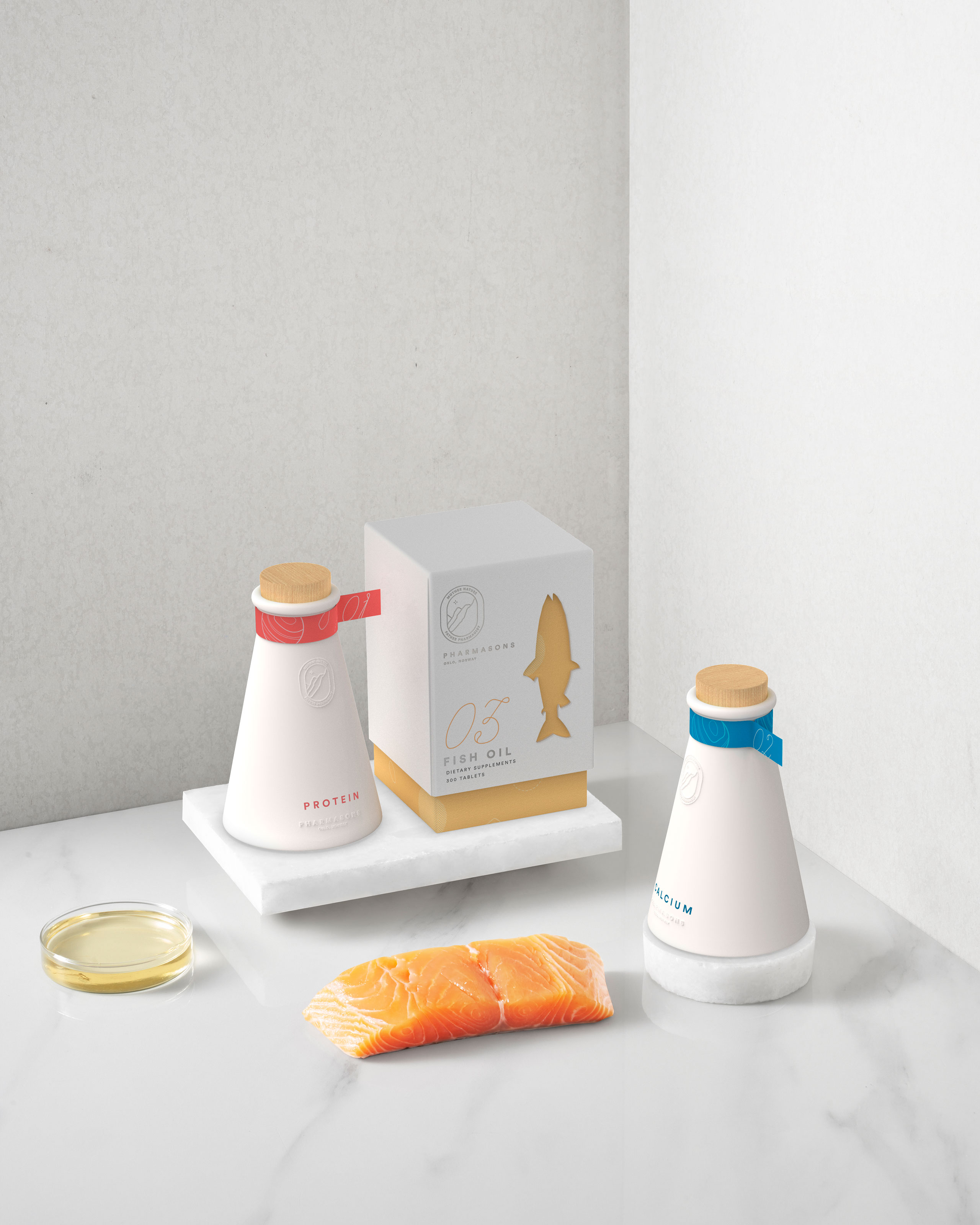
Owned by four sons of a pharmacist, this salmon-based supplement company takes pride in its heritage and Nordic origin. The logomark with four mountains under the Polaris symbolizes both the company’s root and the its familial backbone. The design also feature a pattern inspired by salmon’s texture, topography, and fingerprints.


CREDITS
Creative Director
Giang Nguyen
Designers
Giang Nguyen
Maria Tran
Giang Nguyen
Designers
Giang Nguyen
Maria Tran
Photography
Do Sy Studio
Do Sy Studio