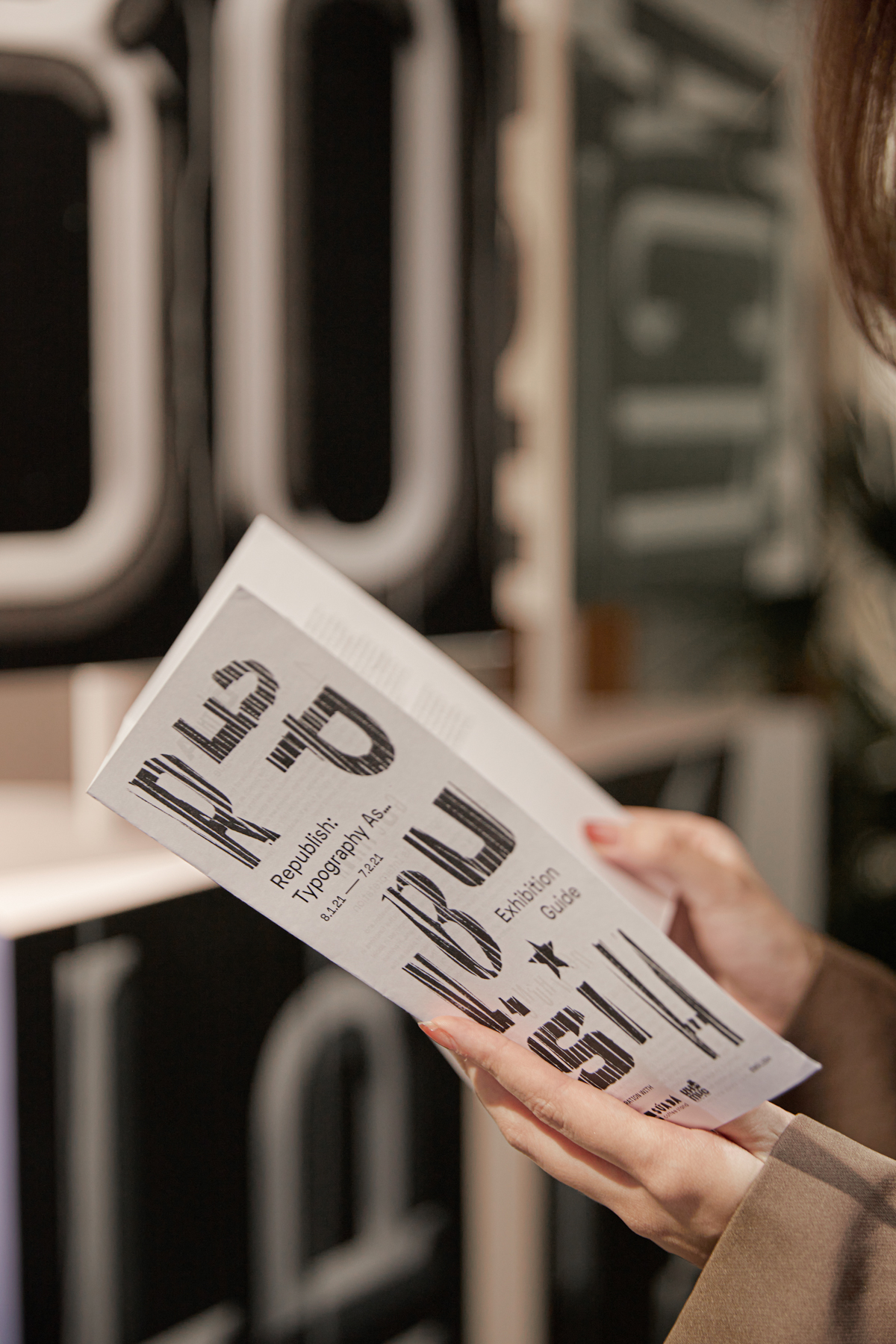
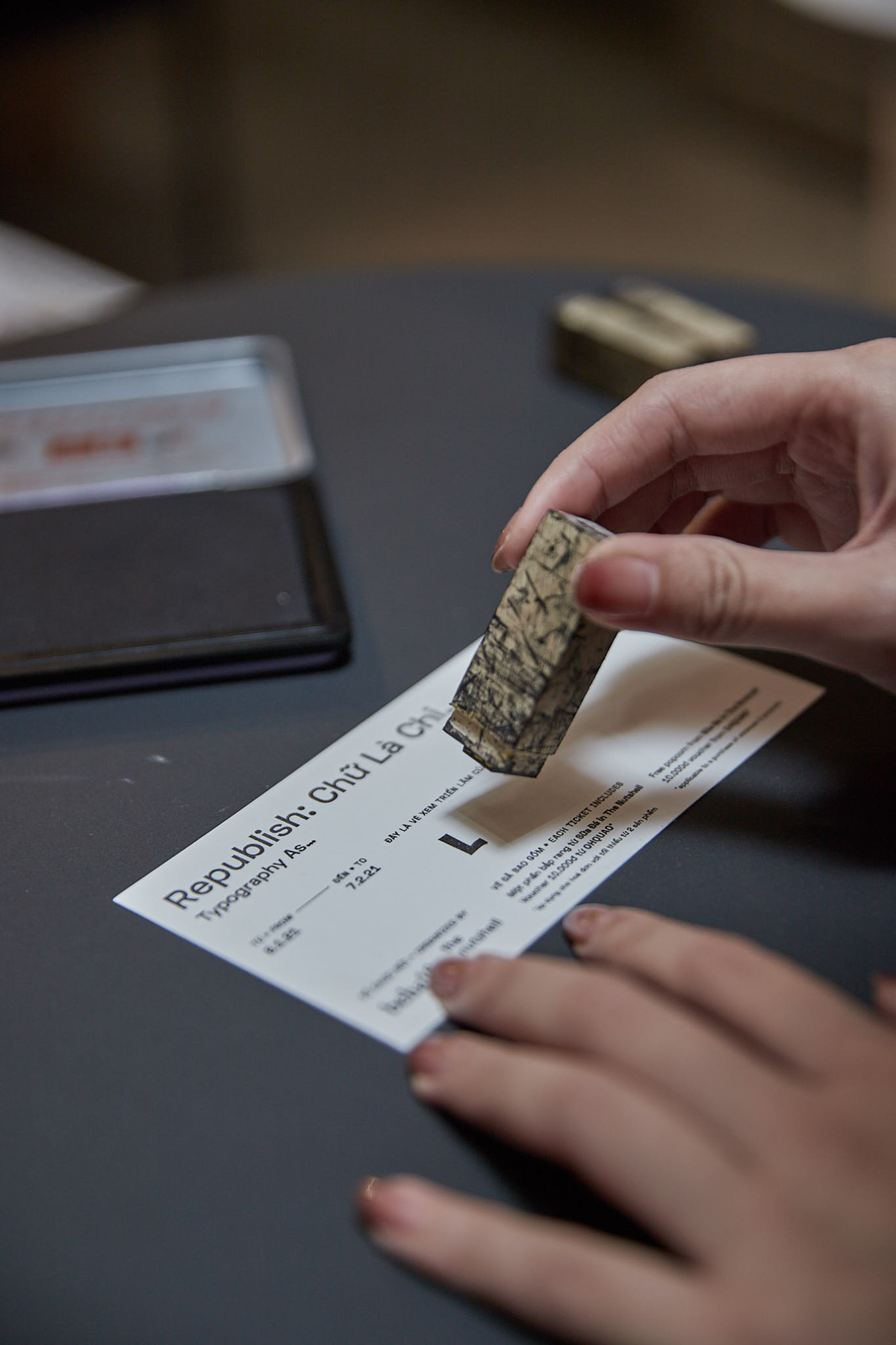
Republish: Typography As… Exhibition
Digital Revival of Vietnamese Typography
Republish is a self-initiated and exploratory project by Behalf Studio. The project seeks to investigate the typographic remnants, hidden in the apertures of Vietnamese urban landscape and archived materials, and revive them into digital typefaces.
Republish: Typography As… is an exhibition organized by Behalf Studio, which showcases Behalf Studio’s dedicated process to research, revive, and digitize organic fonts intrinsically familiar to the country’s urban landscape – an authentic contemporary expression that reflects the team’s inquisitive effort contributive to Vietnam’s ever-evolving creative industries and unique aesthetic identity.
At the same time, through interactive and multimedia installation of original artworks, Republish: Typography As… is the studio’s experimental reimagination and investigation into typefaces’ physical presence in the social fabric of reality, our emotive and instinctive response to their employment in functional contexts (thus their discretely impactful influence on our perceptions in regards to the look and feel of a city, its brands, arts and establishments), as well as our personal relationship to the history and culture of a geographical place we call home.
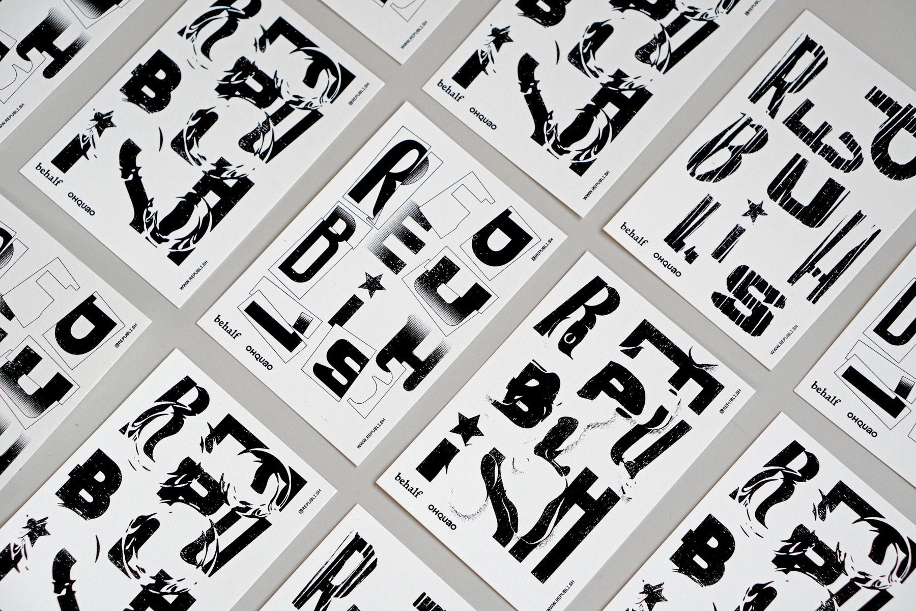
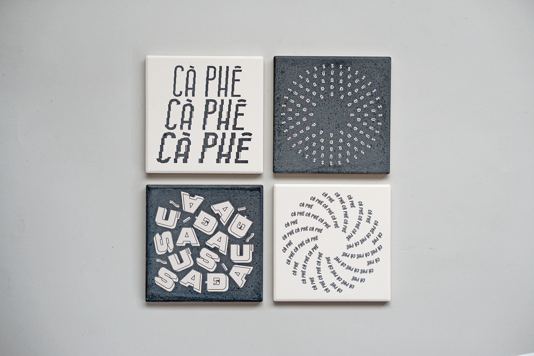
For communication purposes, we have created a visual identity for the exhibition, establishing a design language that imagines the typefaces of Republish in various materialized forms. The designs integrate with the environment on which they are positioned to further reinforce the exhibition's concept.
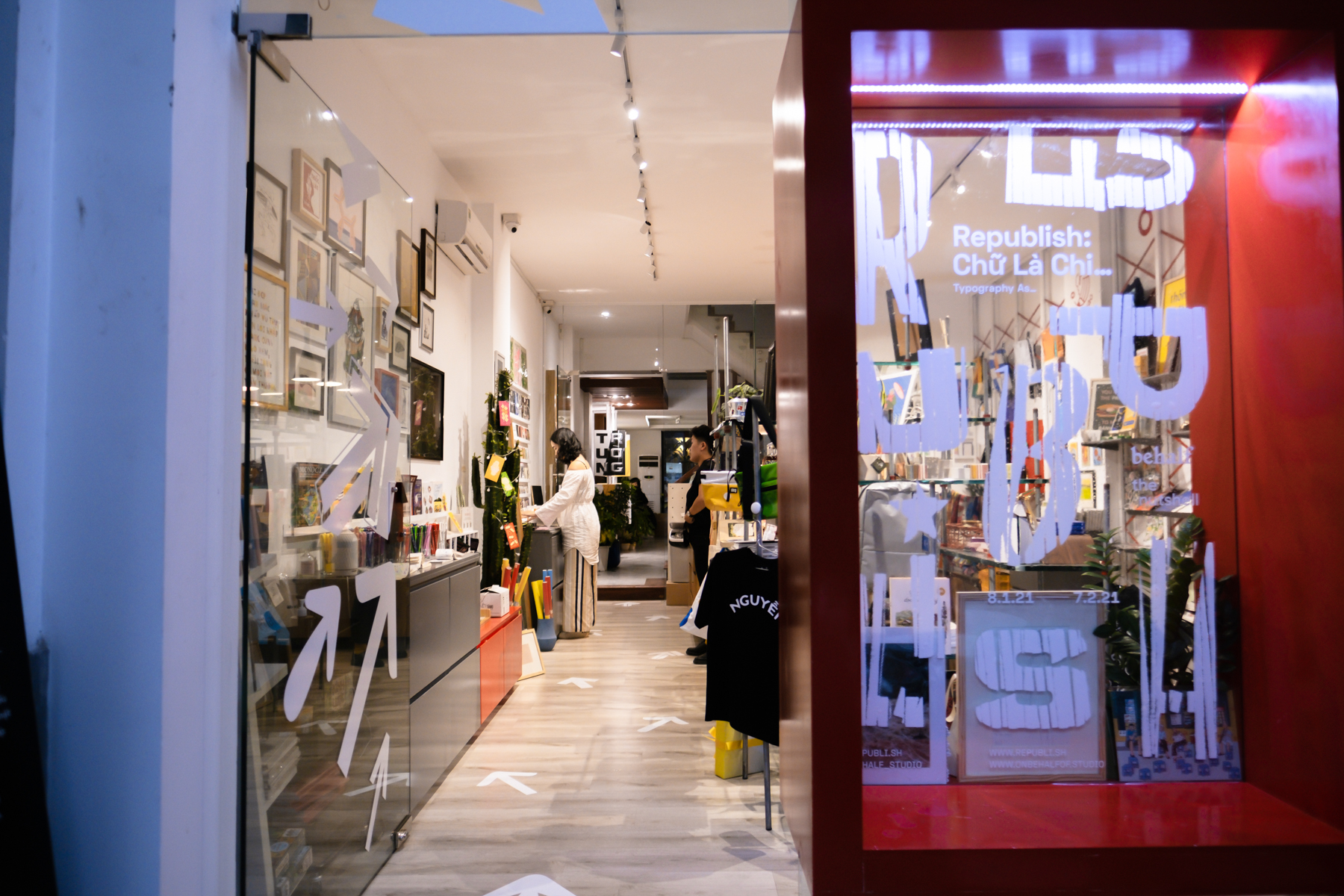
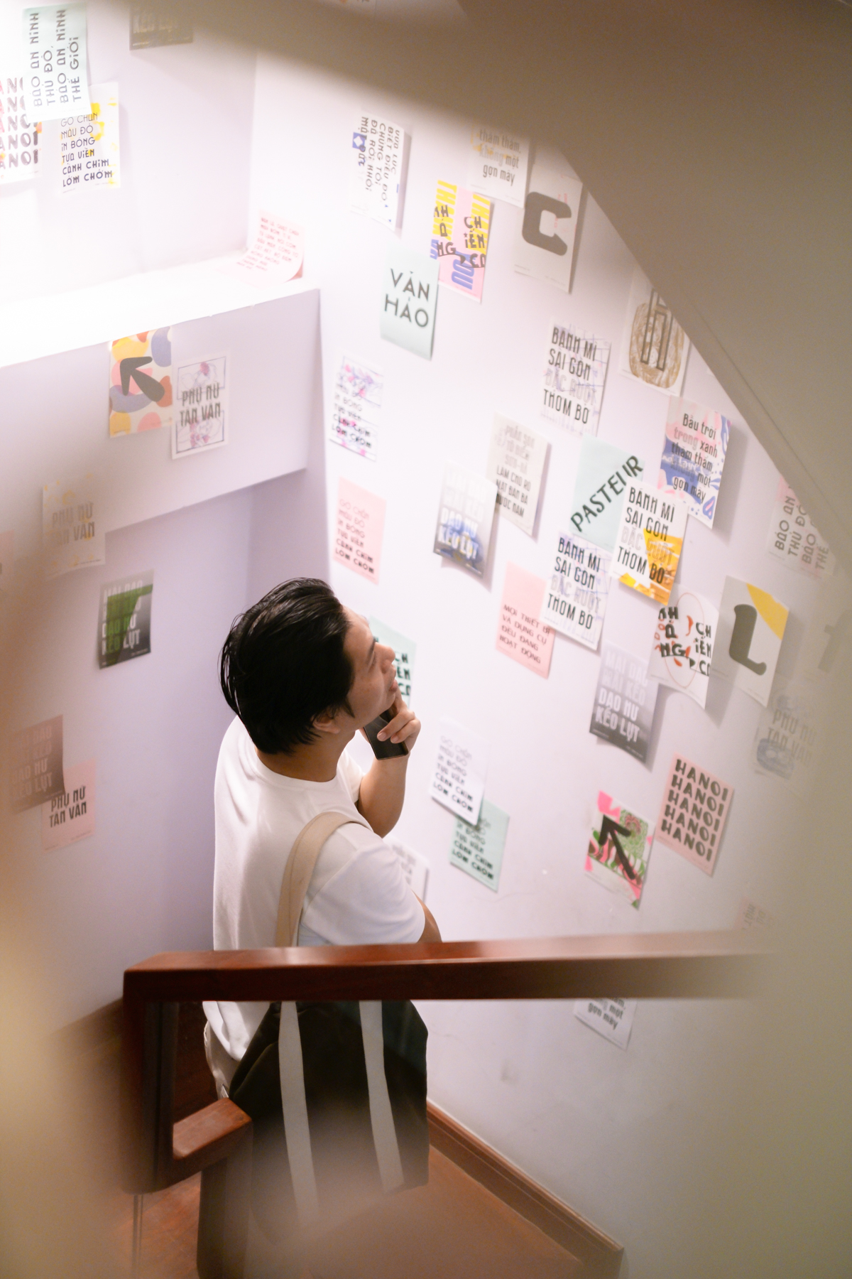
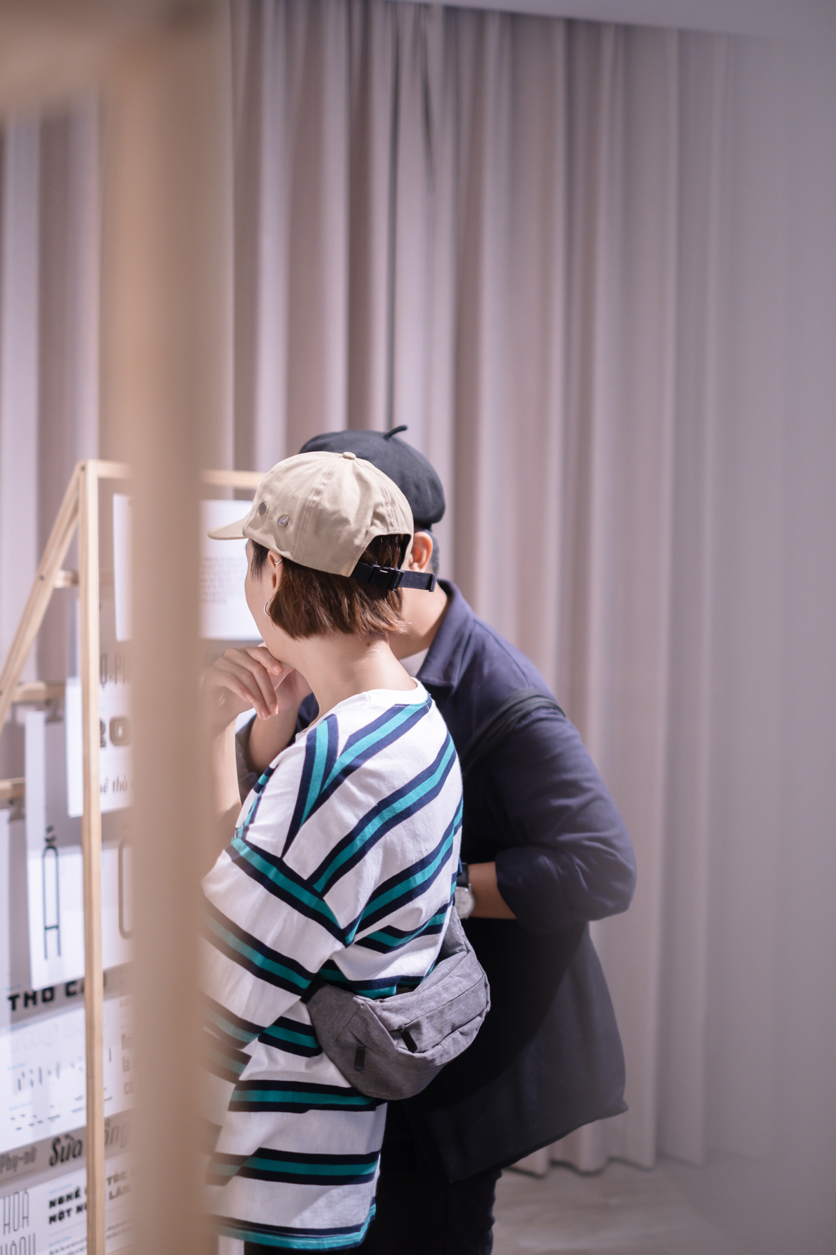
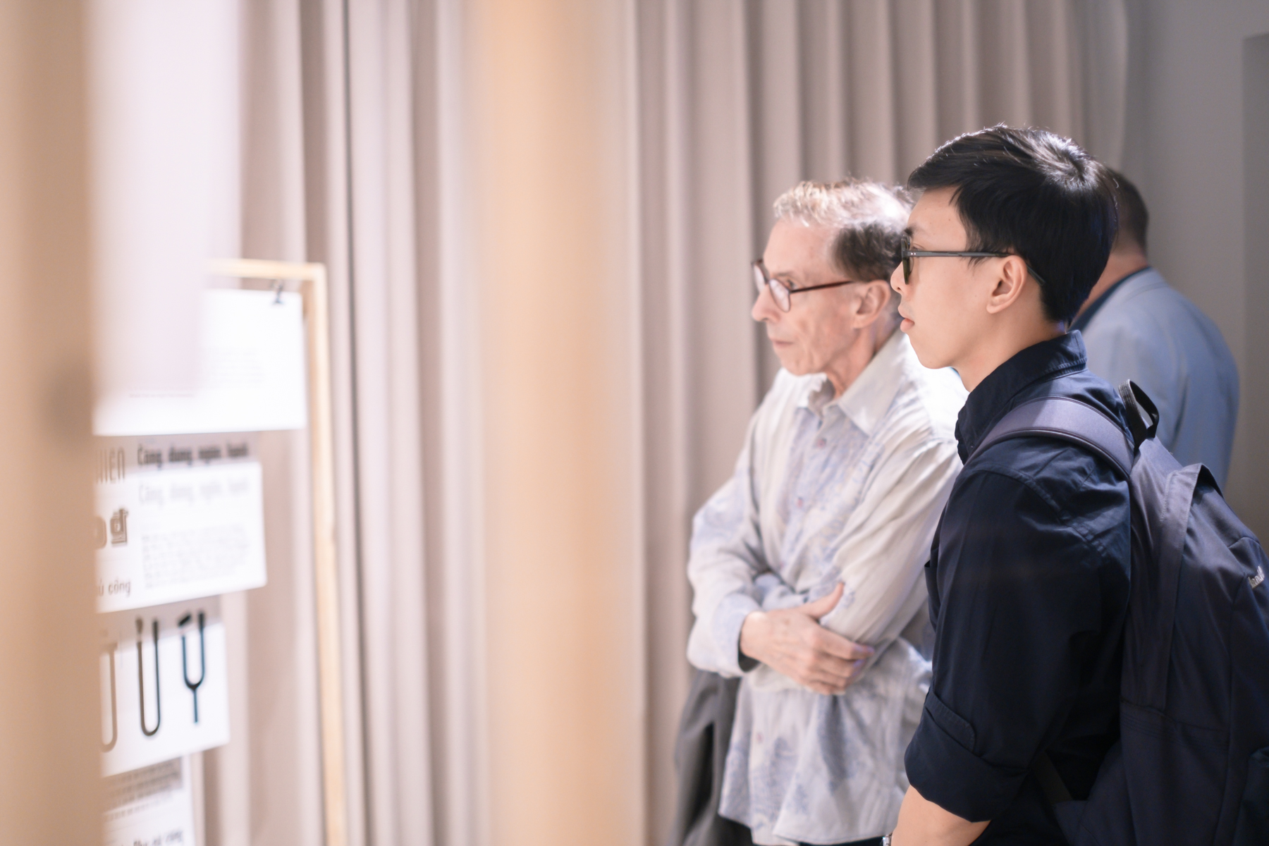
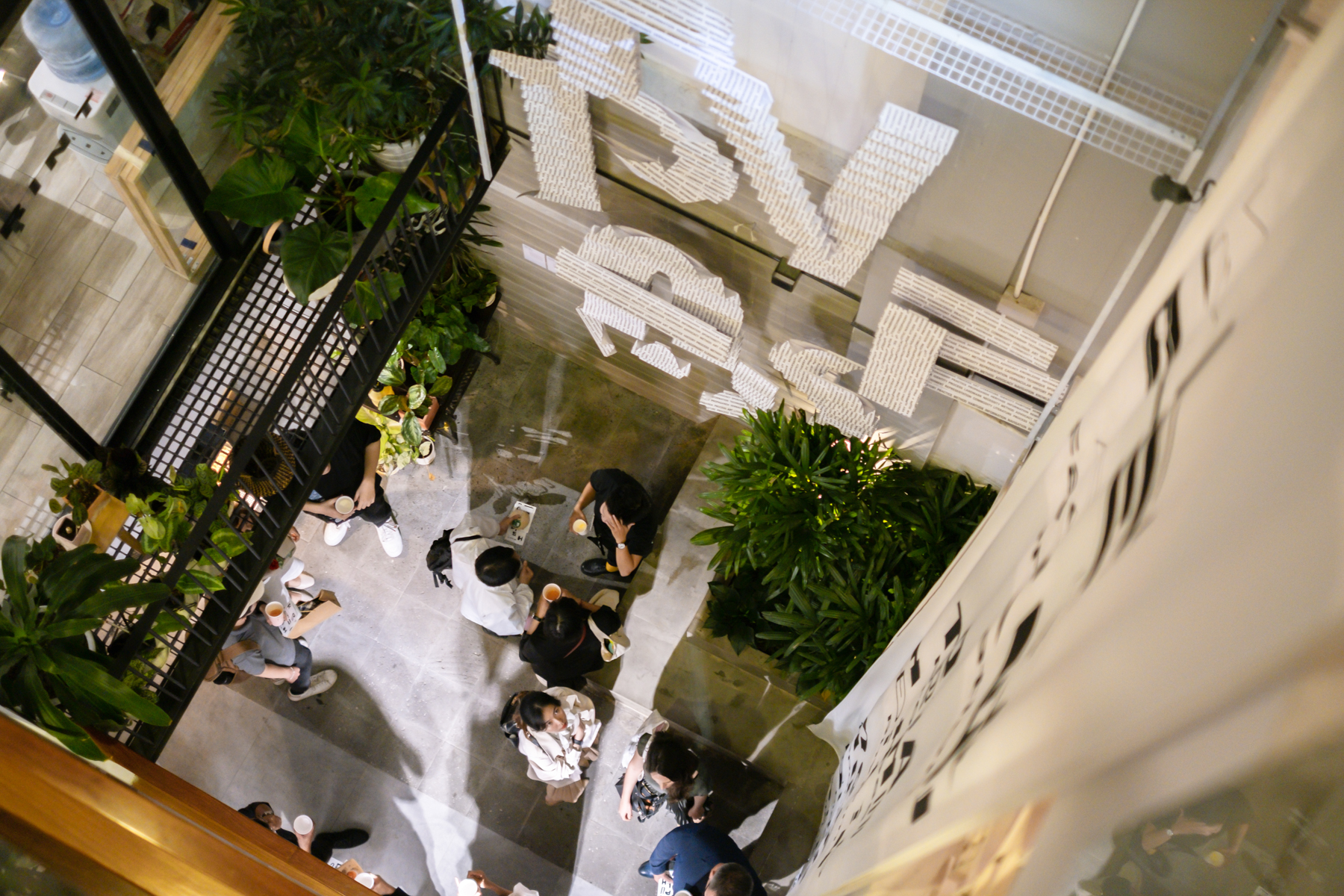
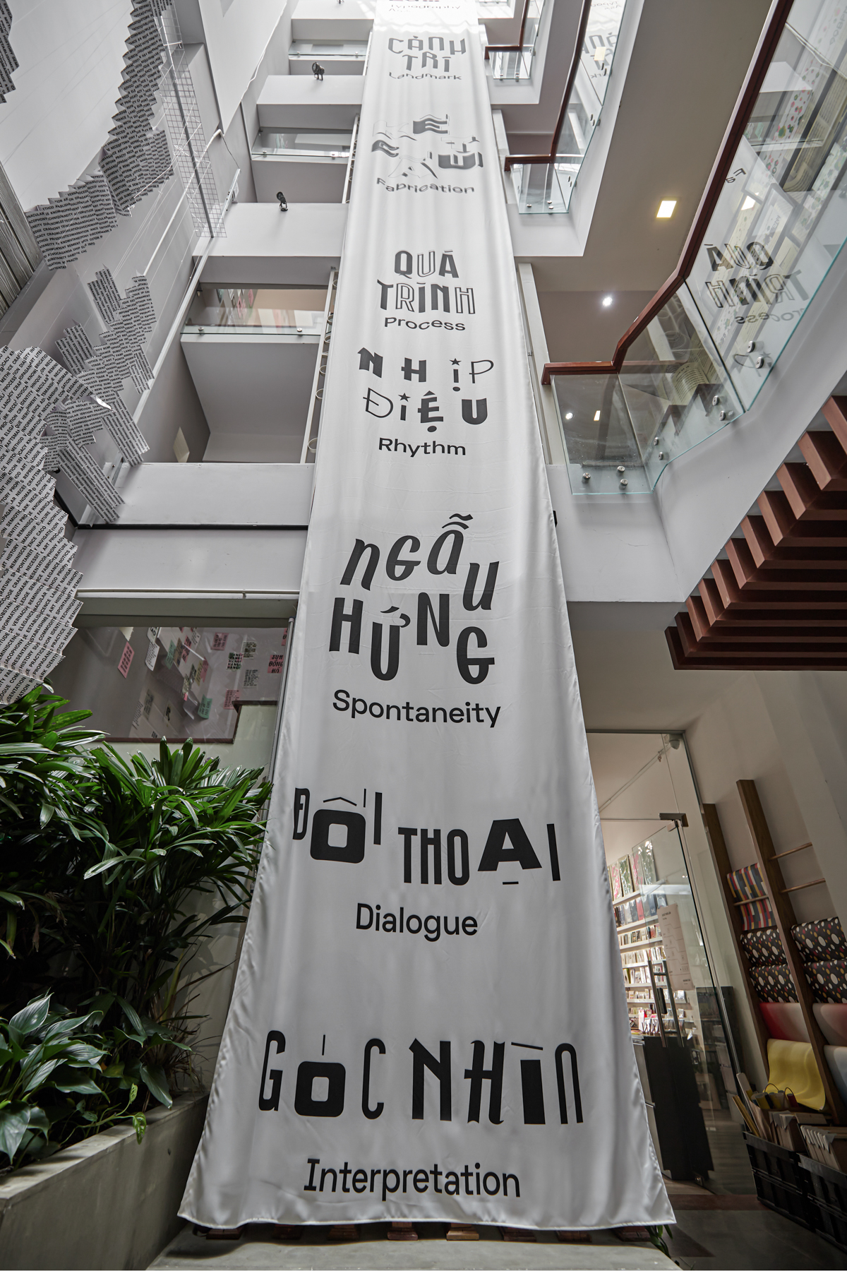
We turned the challenge posed by the venue — The Nutshell — being an unconventional space for exhibition, into an interesting take on spatial experience design. The exhibition integrates its artworks and wayfinding into the building in a way that would not obstruct the building's functions. We also turn the experience of going up the stairs to become part of our artworks narrative and flow. Wayfinding system was design to be both intuitive, while mimicking Vietnamese street flyer culture, utilizing wasted papers of the offices in the building.
ARTWORK
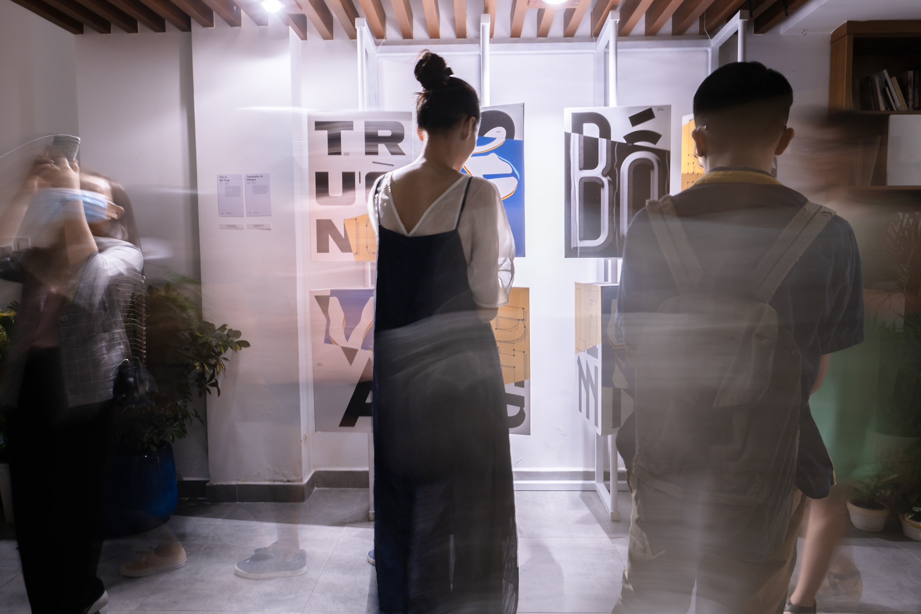
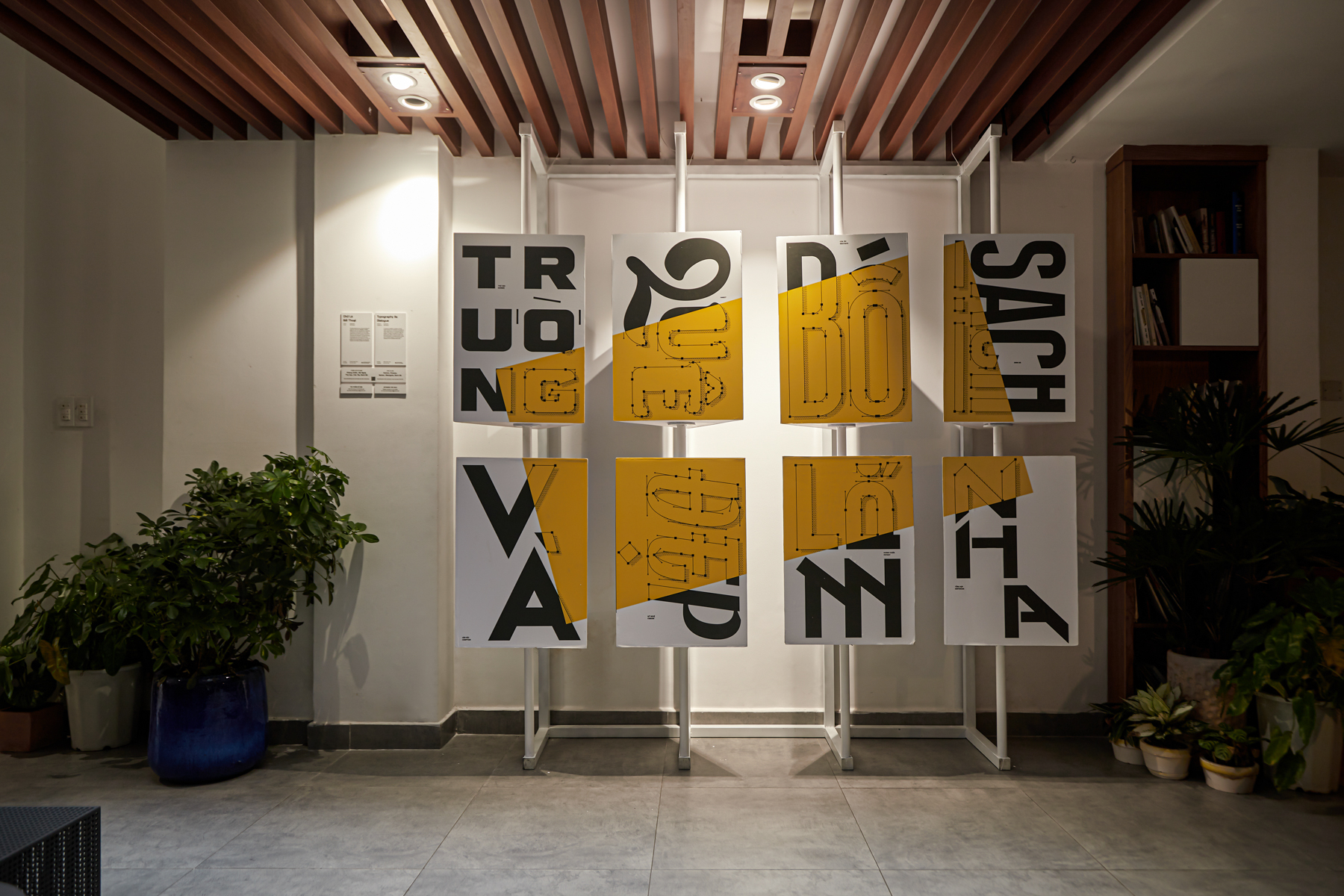
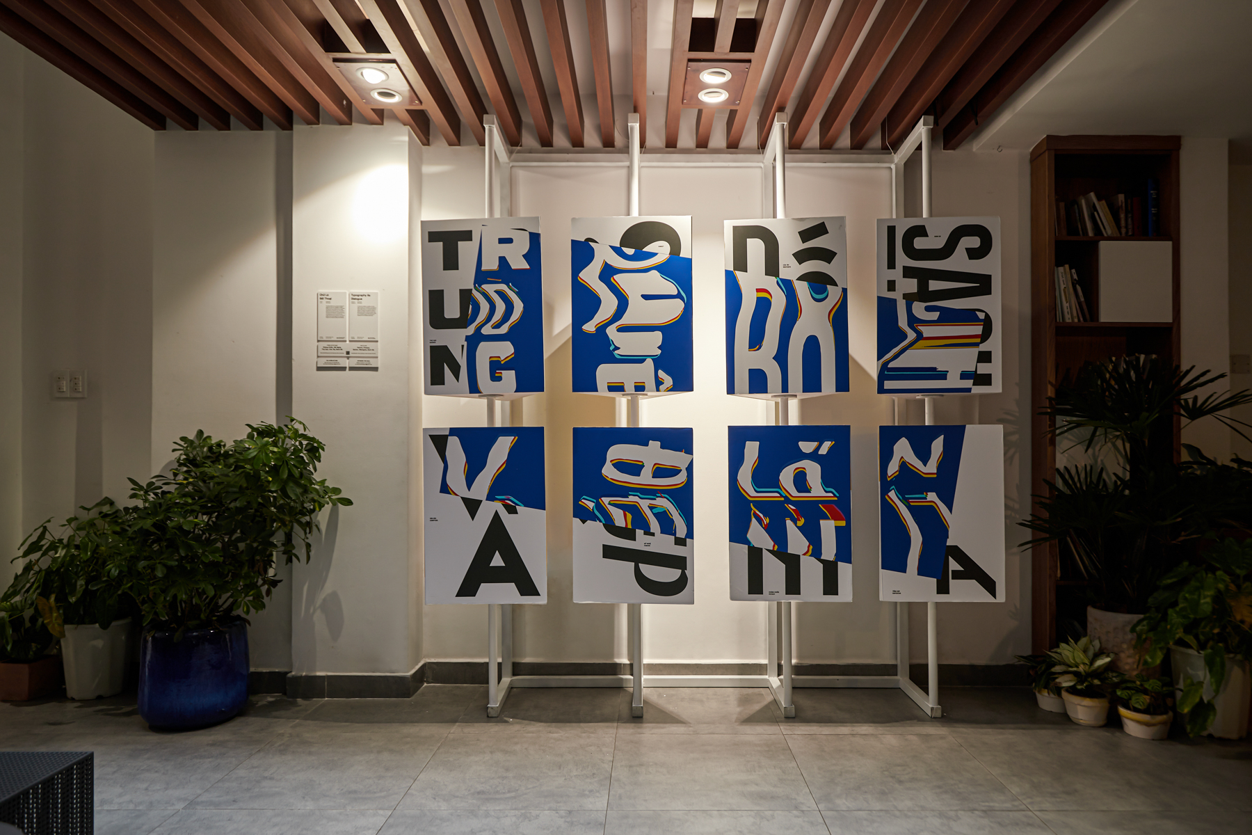
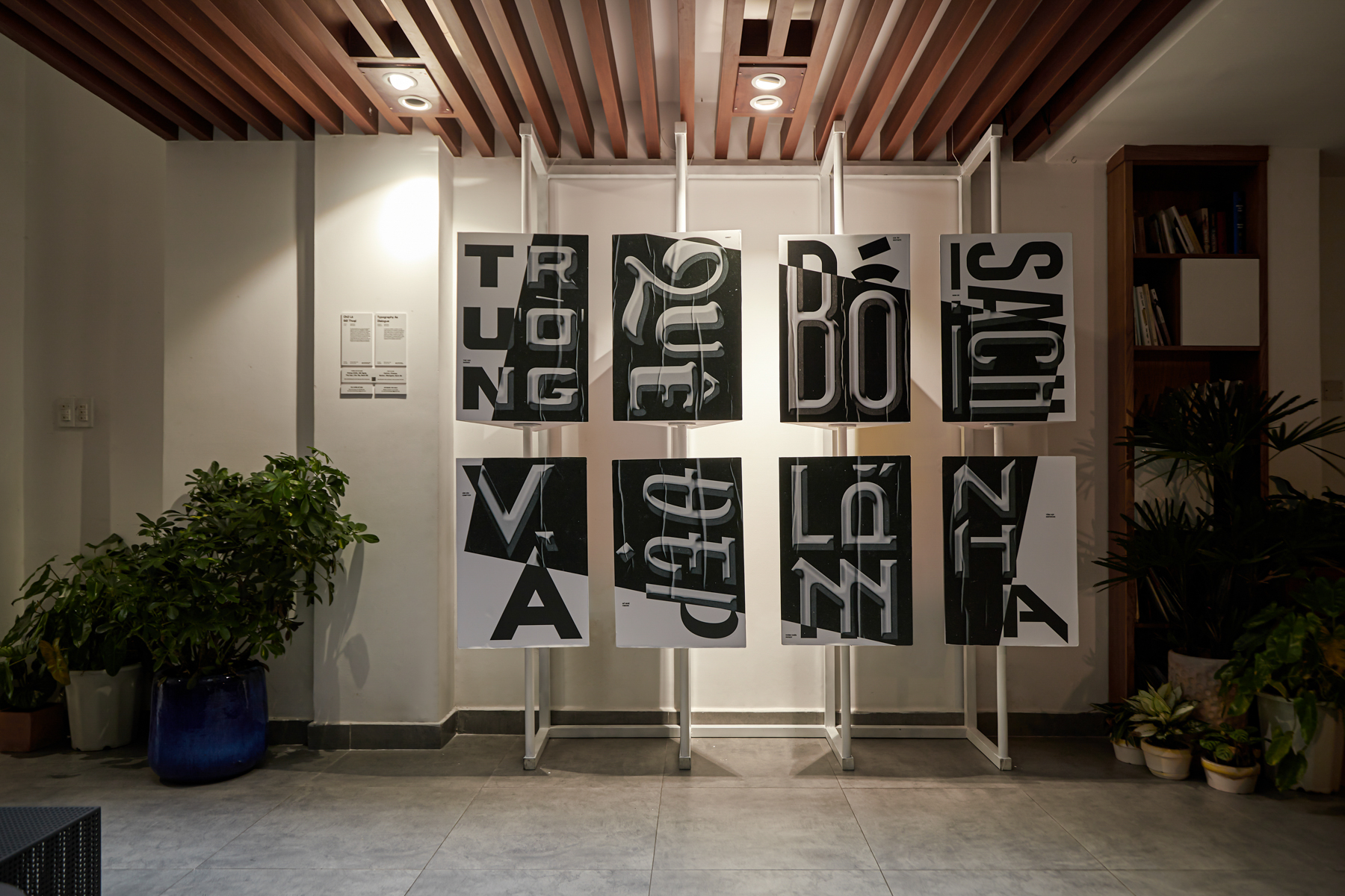
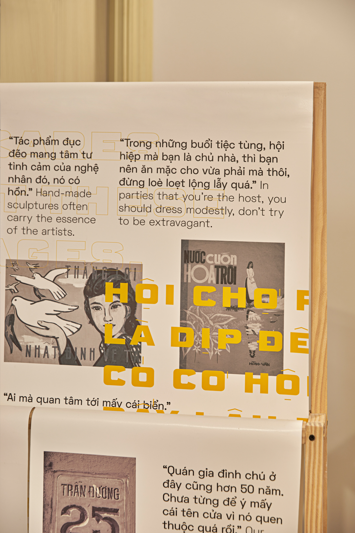
Typography as Dialogue
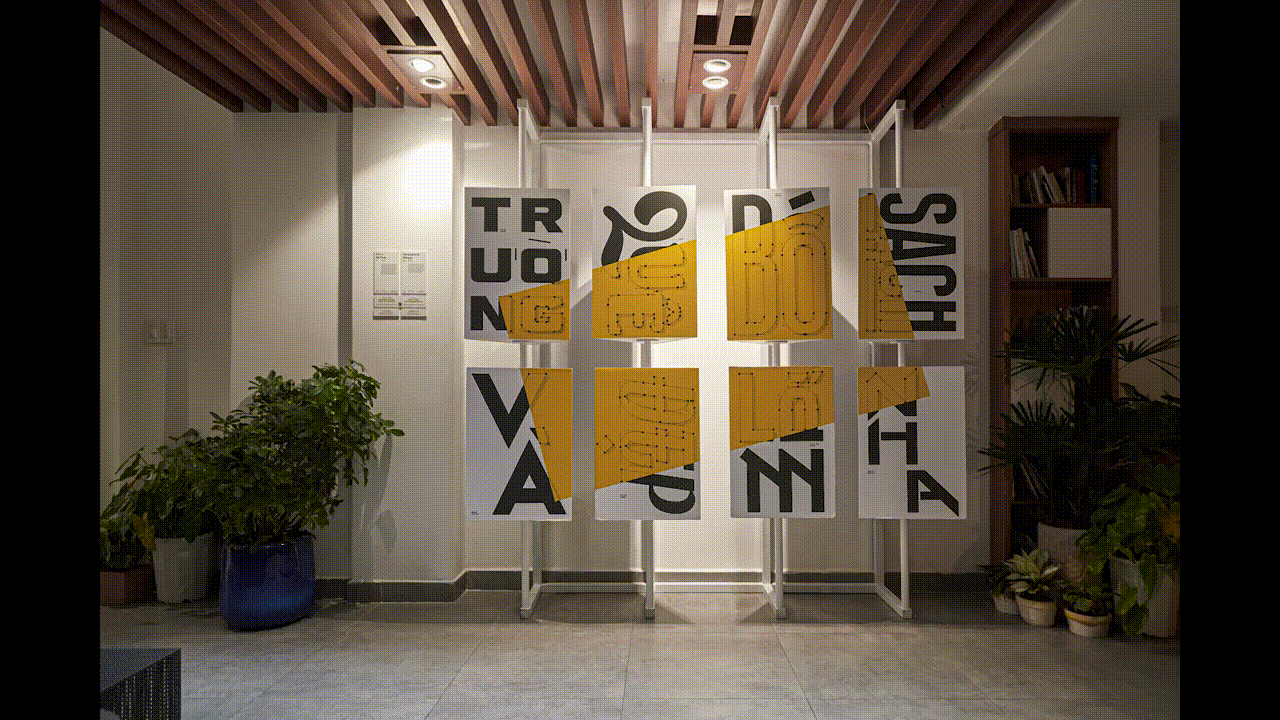
An interactive installation cumulative of the five original typefaces we’ve developed in this project, as well as a playful twist on the conventional format of posters. While exploring the typefaces’s design and aesthetic as enlarged, manipulated and printed on graphic panels, viewers are also encouraged to spin the revolving plates to incidentally discover a phrase, term or sentences relating to the local stories of typefaces and the inspirations behind them.
ARTWORK
Typography as Interpretation
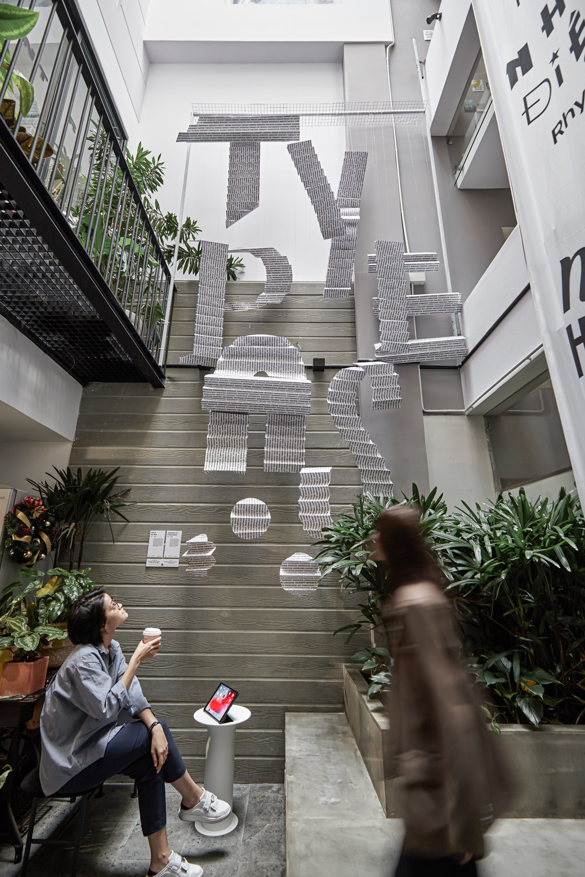
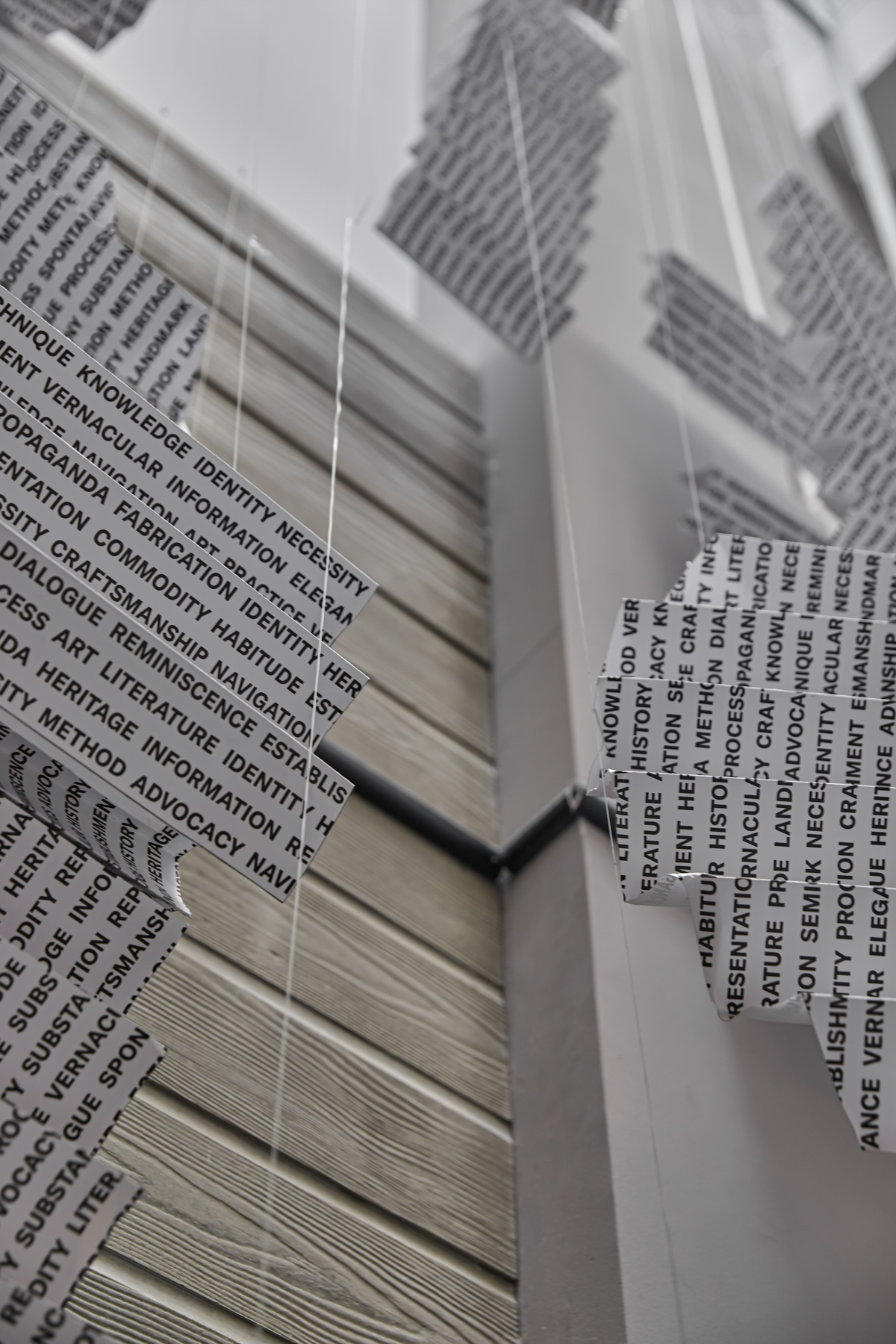
This installation embodies our reflective observation and musing on the manifold forms and communicative functions in how typography is varyingly and creatively employed in social contexts – on streets, buildings and shops’ signs, in printed documents and digital interfaces. The choice of paper as the primary material for this artwork is a loving homage to the history of manuscripts and the printing press. The sculptural folds and curves infer to the metamorphosis nature of typefaces through changing times, adapted and transformed to accommodate the tastes and needs of the people.
ARTWORK
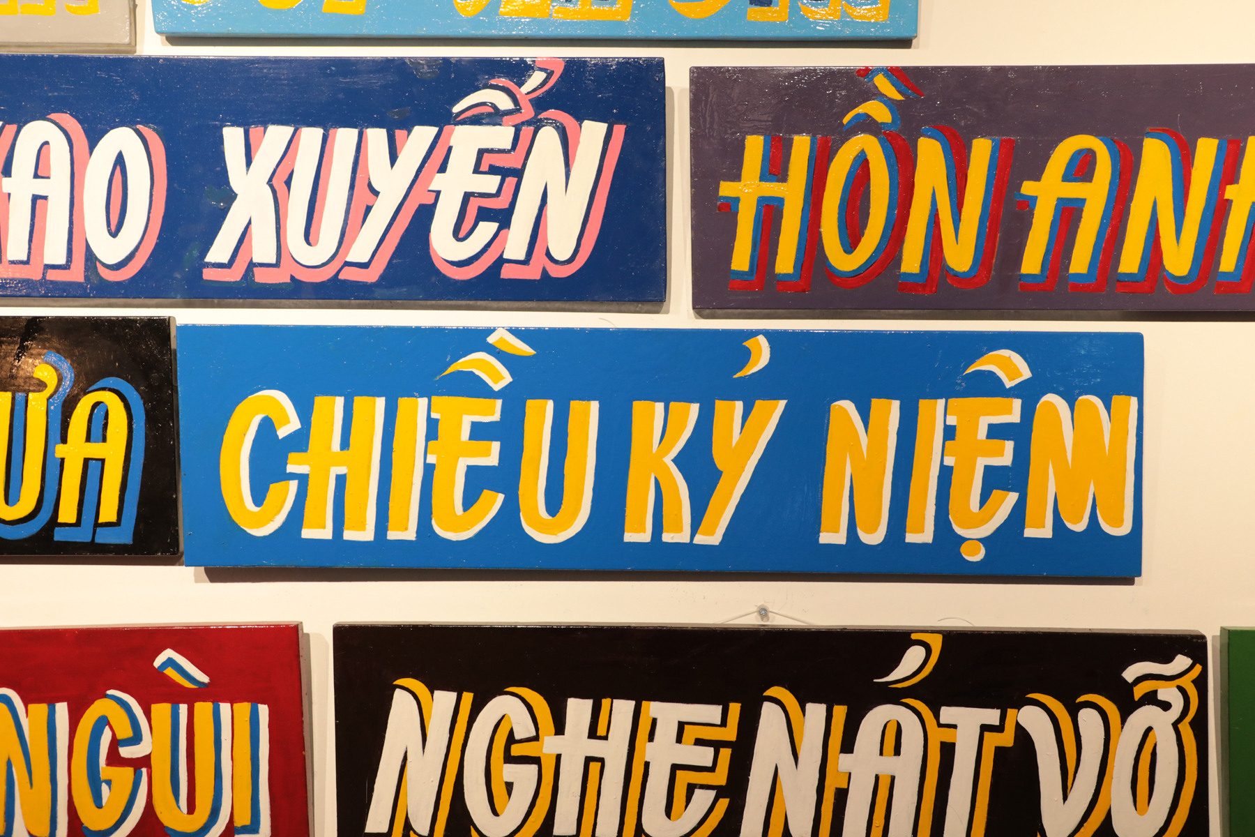
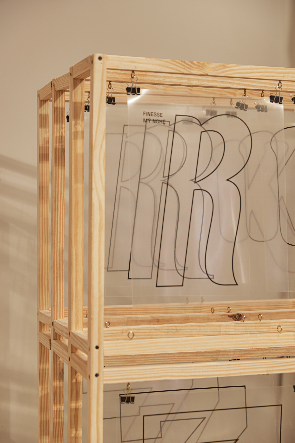
Typography as Spontaneity
dedicated to “Finesse” (Mỹ Nghệ) typeface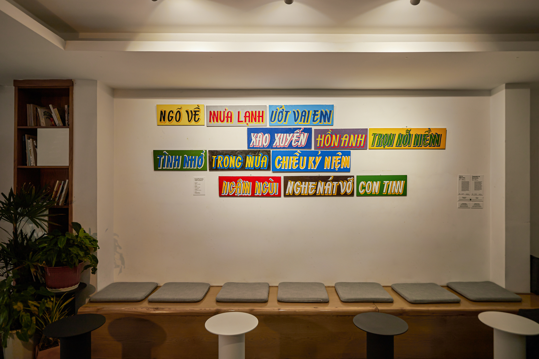
A poetic medley of handcrafted panels by Hoai Minh Phuong, one of the foremost sign-painters still practicing in Saigon, whose lettering work on a watch fixer’s cart inspires our “Finesse” (Mỹ Nghệ) typeface. This artwork is a collaboration between our studio with Mr. Hoai, whose decades-long practice, and his love for poetry, bear resemblance to our own ethos within this project: discipline, passion, and a sense of fun, freedom and improvisation. It hammers home the transposition of a typographic life cycle: starting with the analog format found in Mr. Hoai’s lettering, then developed into the digital world through our design process, and finally, transformed once again into a unique piece of art. These compositions equally demand an eye and mind for humanistic beauty, as well as an appreciation for craft born out of years of honing one’s intuition, study and practice.
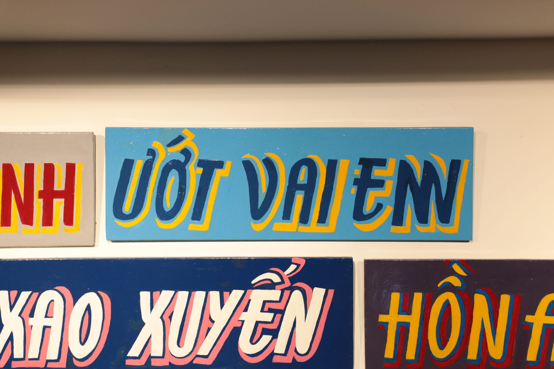
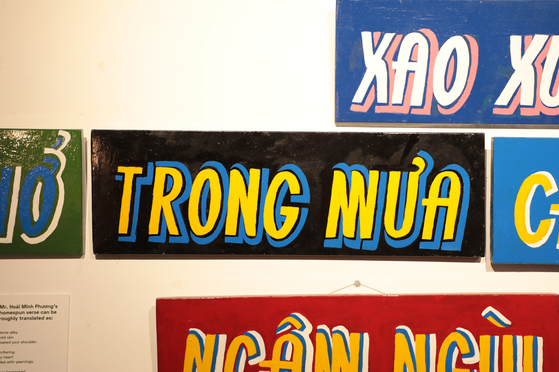
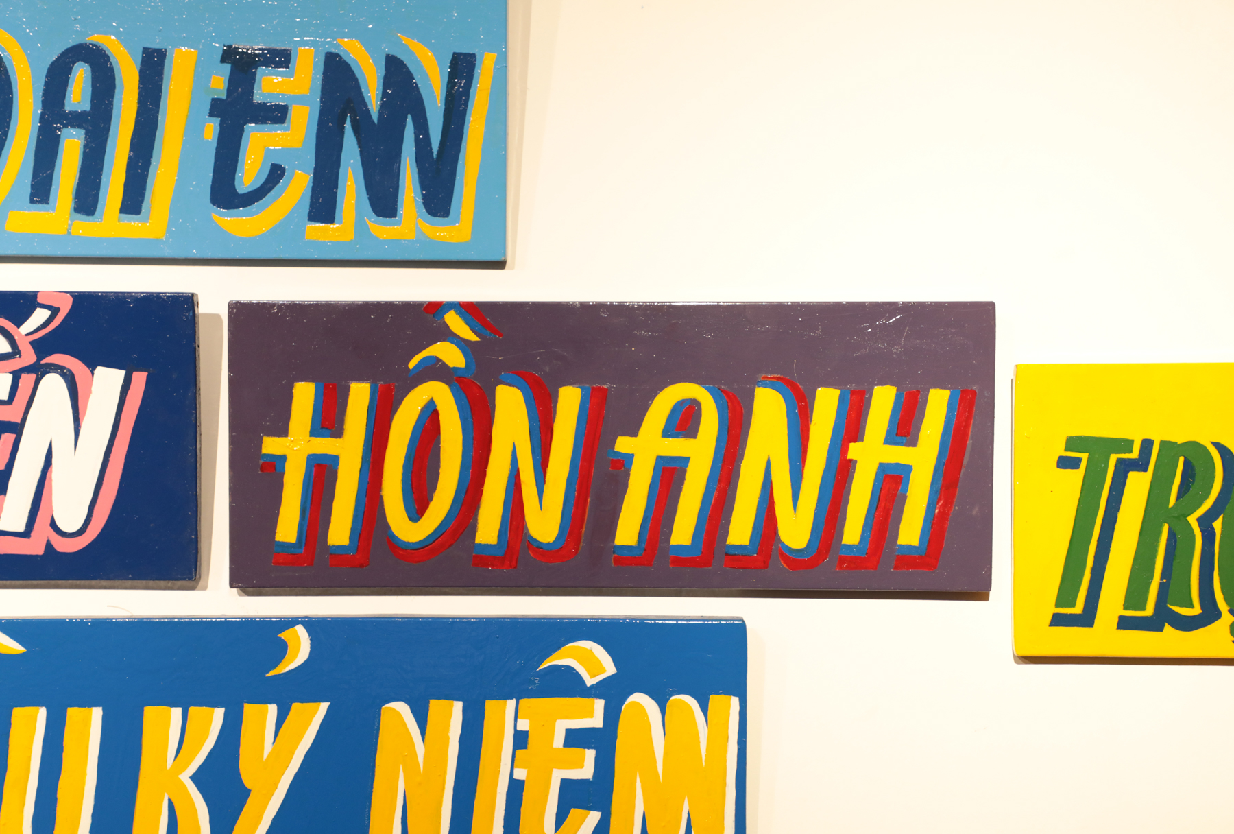
Each sign is a unique edition of one. Profit from the sale will be contributed toward the Republish project, and the artisan.
The artwork was so well-received during the exhibition, so we are selling the signs, separately, through the Painted Poetry website. The exhibition was the only and last time the signs are together to create the whole poem, akin to the decaying nature of vernacular typography & sign-painting as a craft.
http://www.poetry.republi.sh/
http://www.poetry.republi.sh/
ARTWORK
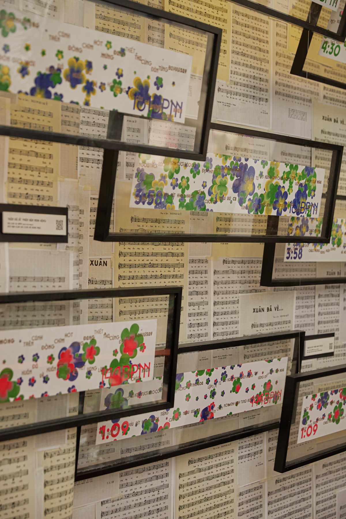
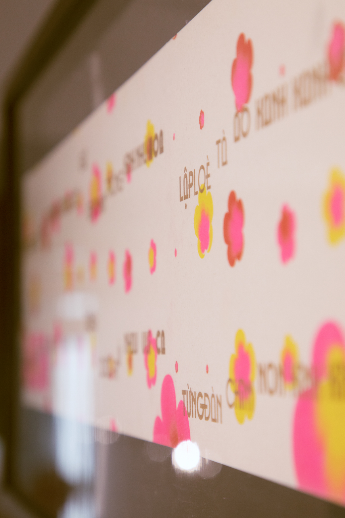
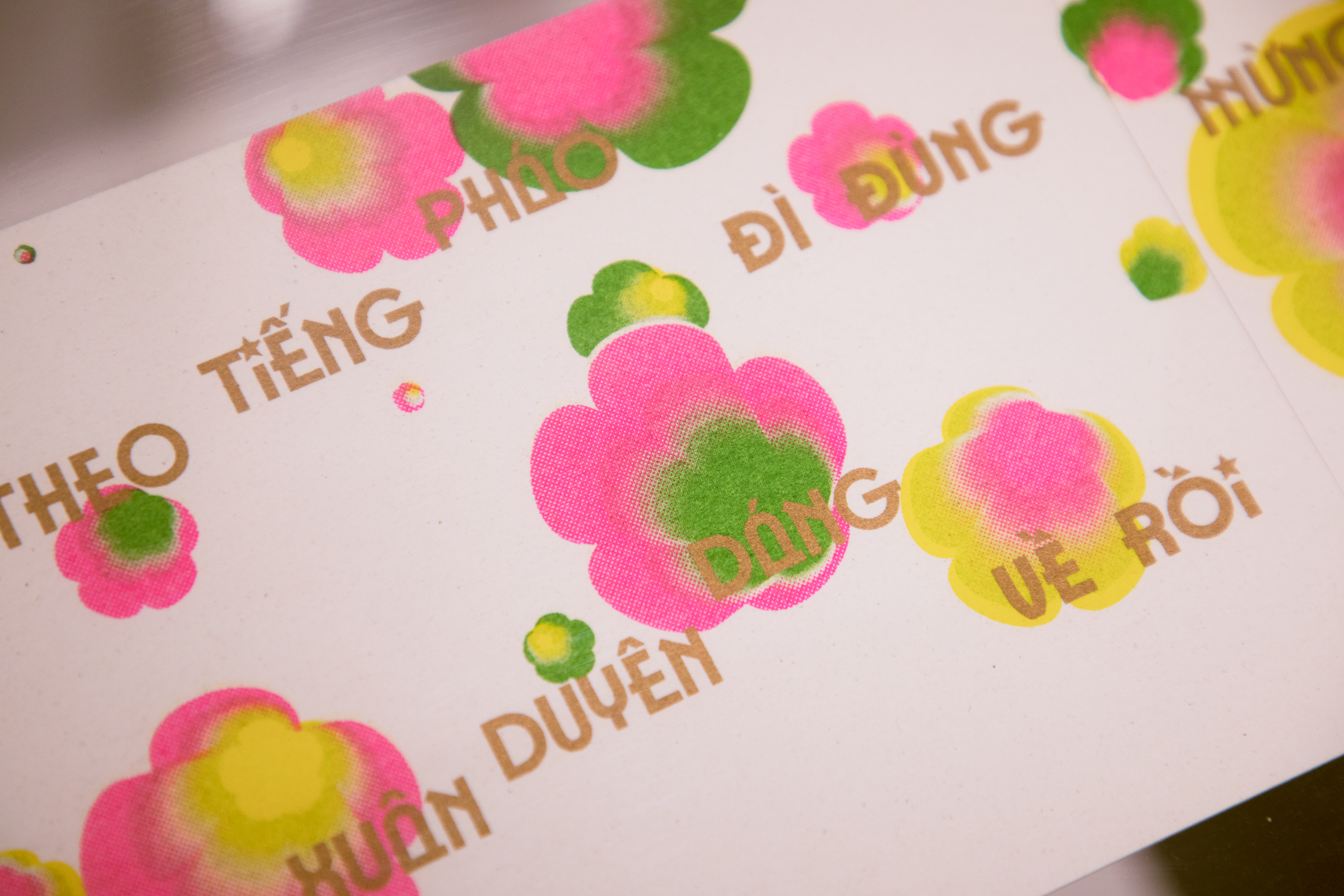
Typography as Rhymth
dedicated to “Finesse” (Kháng Chiến) typeface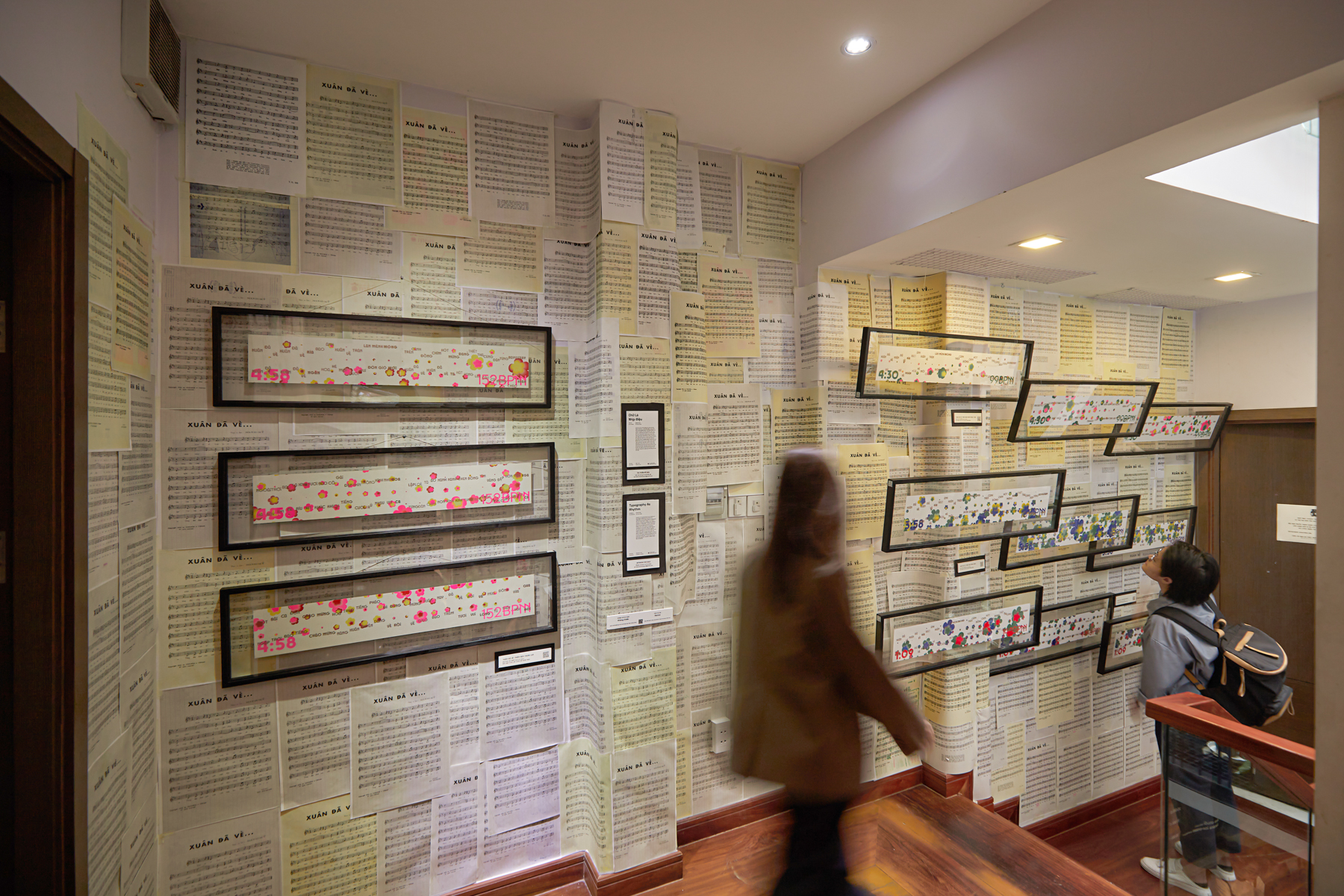
Inspired by the experimental music notations of John Cage and Brian Eno, this artwork is a collaboration with Kho Muc Studio, an independent riso print studio based in Saigon. The 4 sets of triptychs correspond accordingly with 4 different renditions of “Xuân Đã Về,” a popular Vietnamese song commonly played during the country’s Tet Holiday. They combine layers of typographic visualization of the song’s sheet music, together with abstract elements that Behalf’s bespoke program generated out of the sound data from the song’s music videos through various eras. This section highlights a correlation between our efforts to revive and update traditional typefaces with how a pop song is also given a new life every time it’s performed, covered or remixed to reflect modern day’s sensibilities.
ARTWORK
Typography as Process
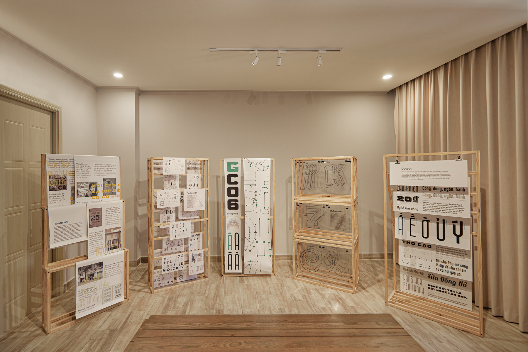
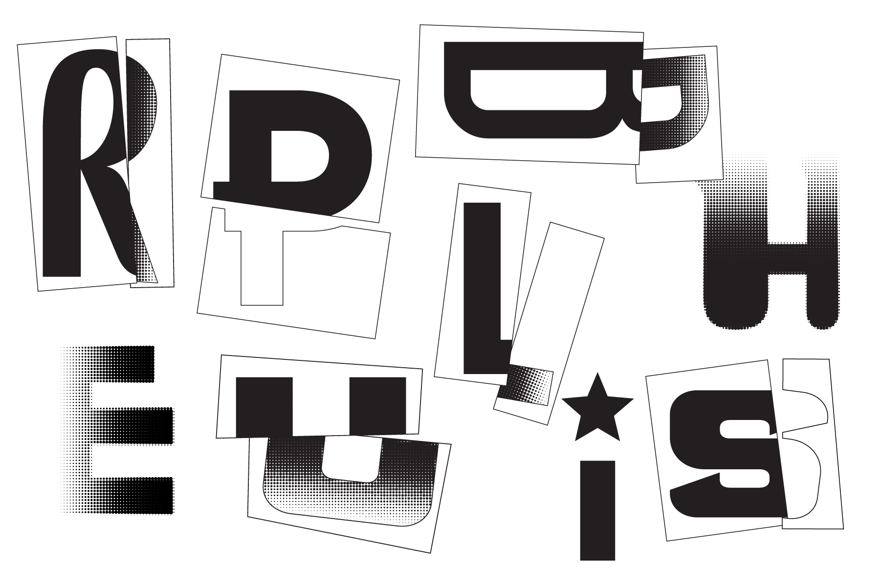
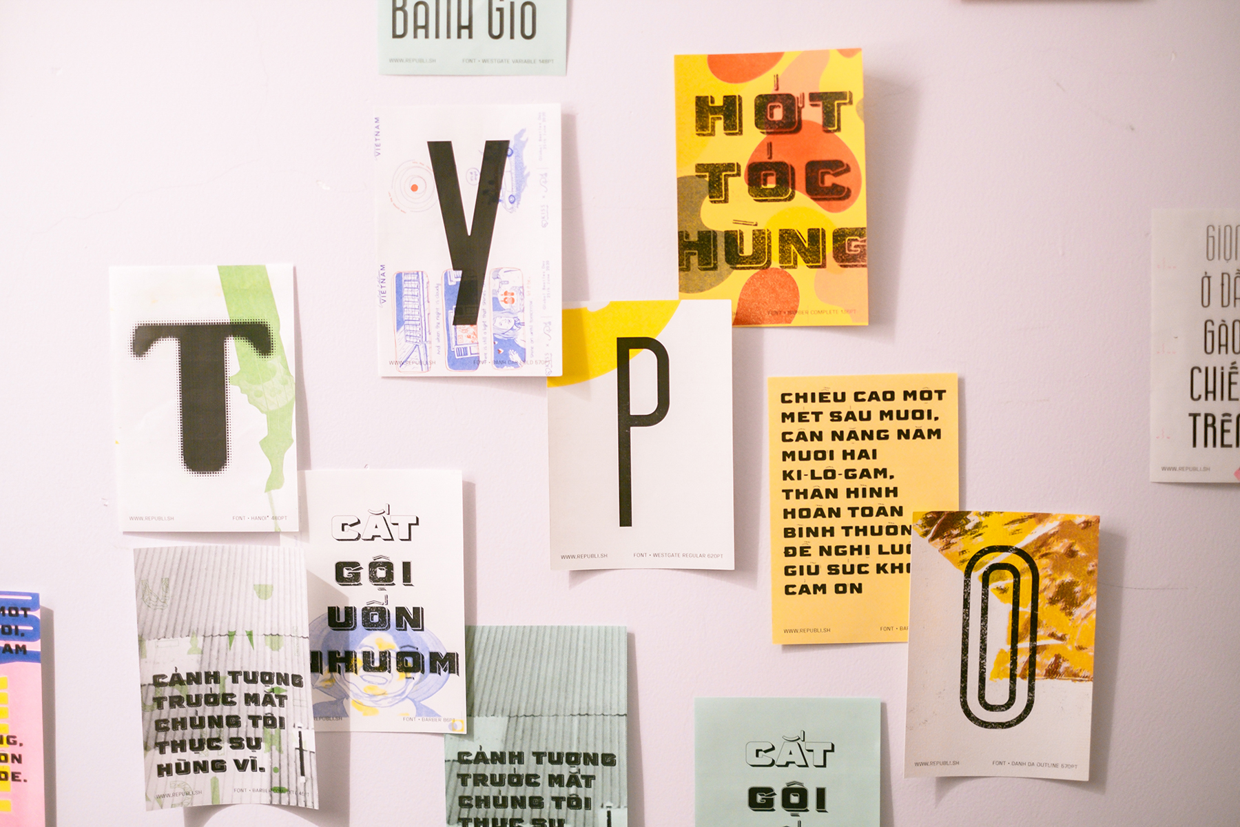
Explore every step behind the inner makings of our original typefaces. From the investigative research in which we scout Vietnam’s urbanscape and cultural archives for inspiring remnants, to the developmental process that entails studying, sketching and designing new typographic sets based on the existing materials we collected. The overarching vision is not only to reconstruct and reserve the essential qualities and distinctive characteristics of the original letterforms, but at the same time update and translate them into digital formats applicable and viable for contemporary users.


ARTWORK
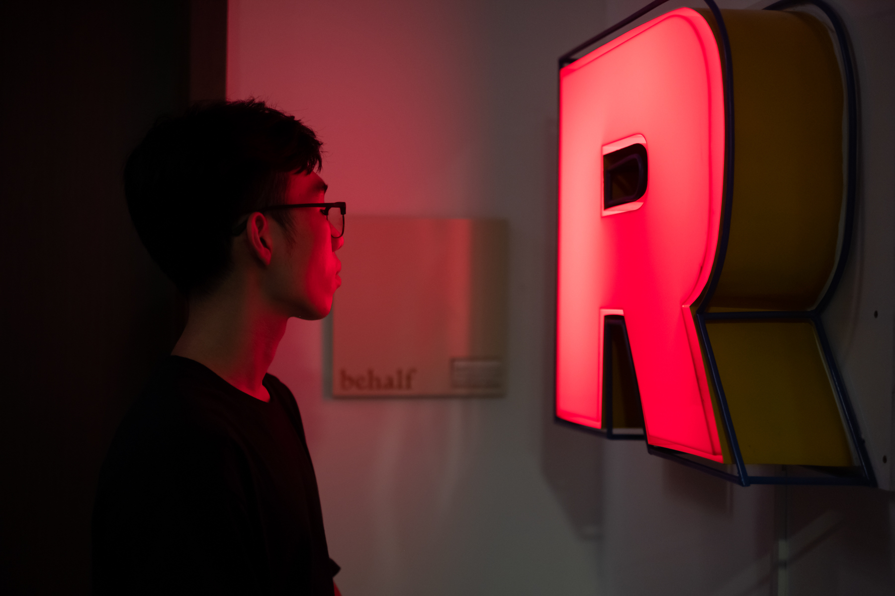
Typography as Fabrication
dedicated to “Barber” (Thợ Cạo) typeface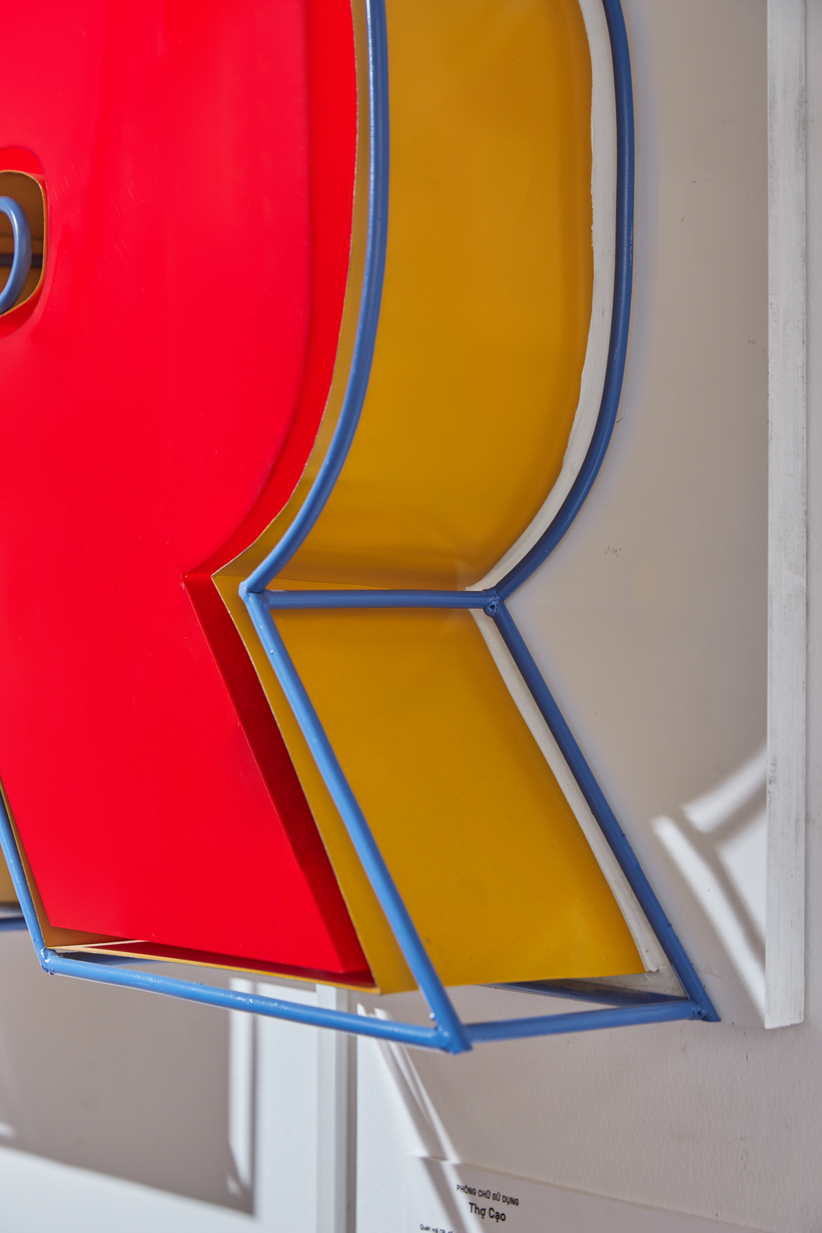
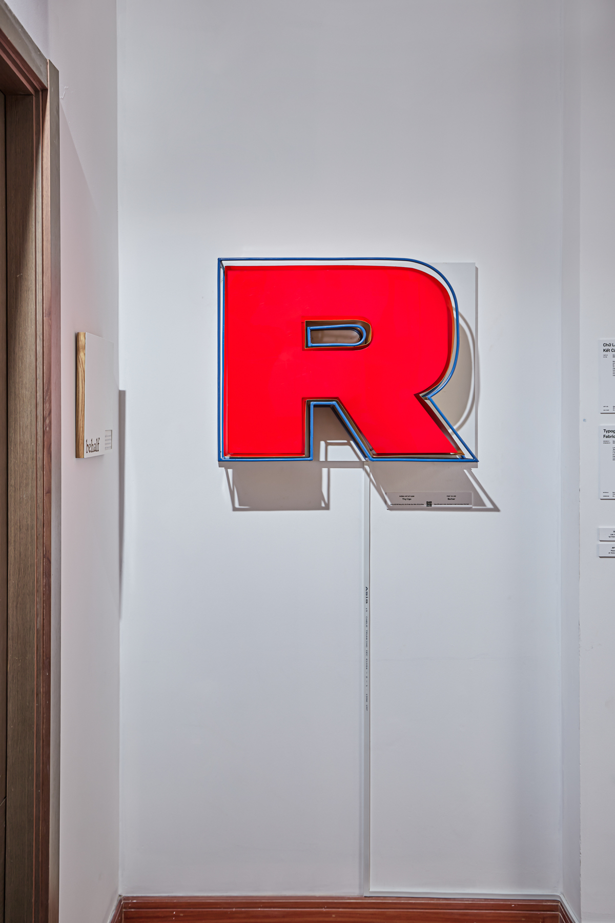
A physical rendition of the letter “R” from our “Barber” (Thợ Cạo) typeface, which was derived from a hand-painted sign atop a local barber shop in Saigon’s District 5. The interplay between light and shadow in this artwork is a direct visualization heightening the dimensional facets through which typography (and its myriad colours) occupies and asserts its presence in our everyday life.
ARTWORK
Proposals for a Translation
part of artist Huong Ngo’s exhibition, featuring Đanh Đá typeface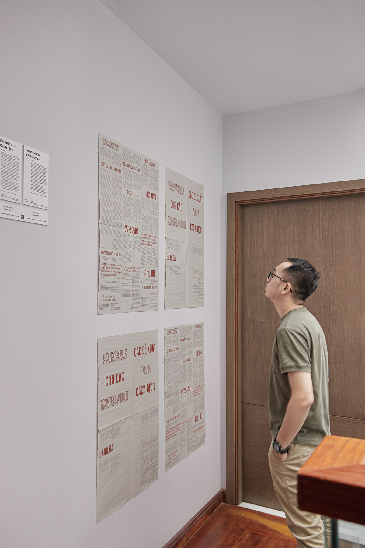
The class-based struggle of the Communist movement overshadowed the Vietnamese women's rights movement of the early 20th century, leaving an incomplete framework and clumsy translation of the term "feminism." Artist Hương Ngô reached out to a group of artists and thinkers that identify as Vietnamese for possible translations for the term "feminism" into Vietnamese. Using their replies, she created a set of stamps (carved with the participants' proposed narratives, explanations, and translation of feminism), which was then used to print the accompanying publications. This solicitation for a translation acts not only as a proposal for a literal translation, but also a proposal for the very process of translation itself.
"Đanh Đá," the font used in this work, was created in collaboration with Behalf Studio. It is based on the display typeface for Phụ Nữ Tân Tiến, a women's magazine published in Hue in 1932, which was requested by Nguyễn Thị Minh Khai in her letter to one of her fellow organizers/comrades.
ARTWORK
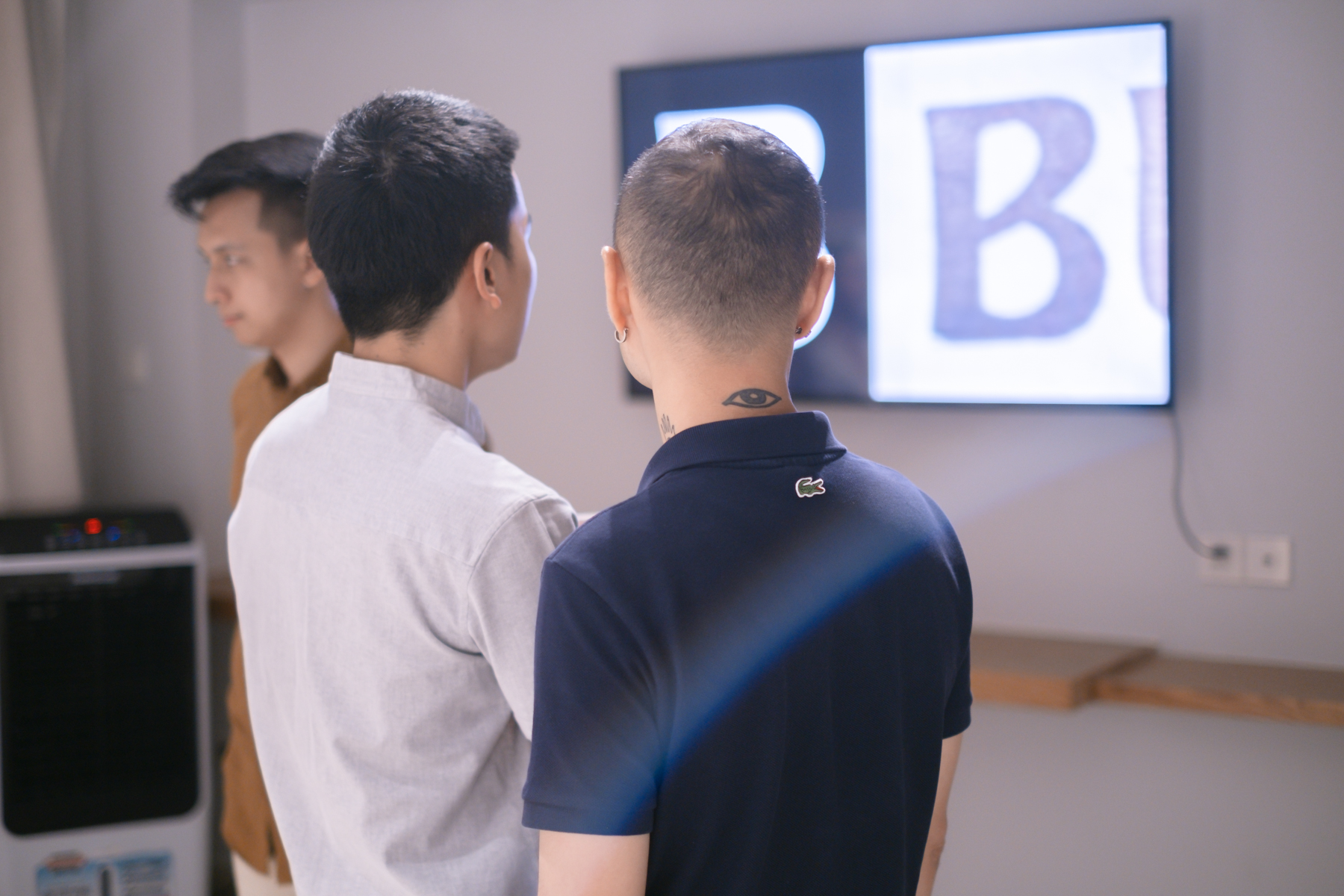
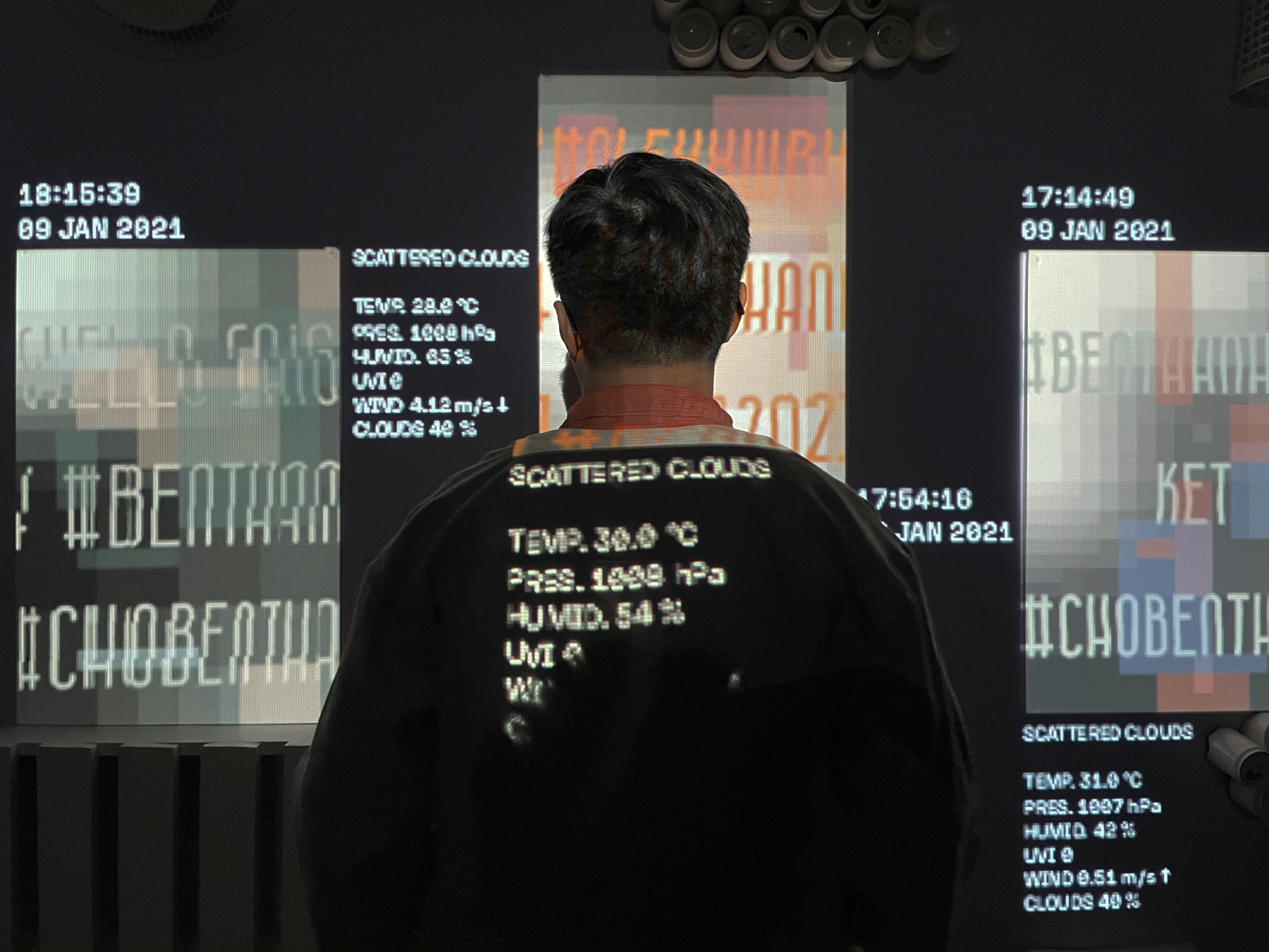
Typography as Landmark
dedicated to “Westgate” (Cửa Tây) typeface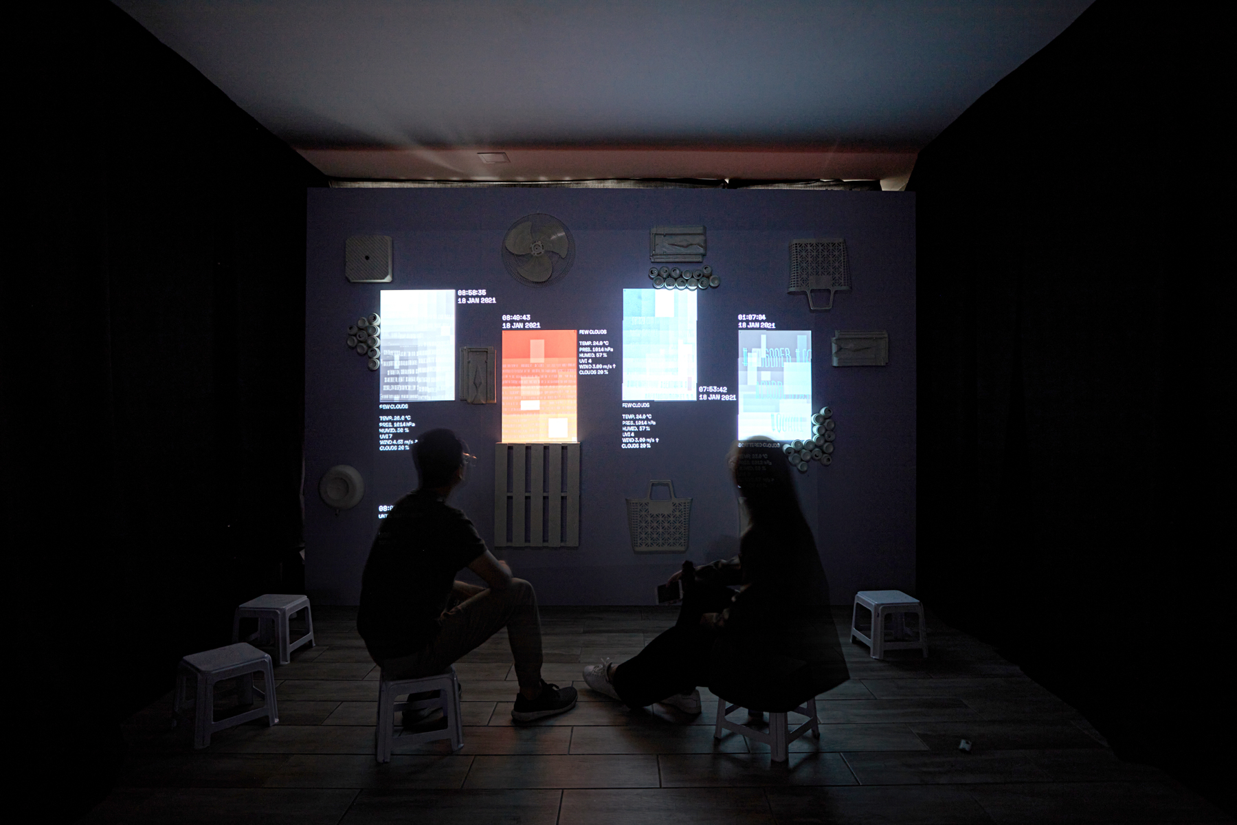
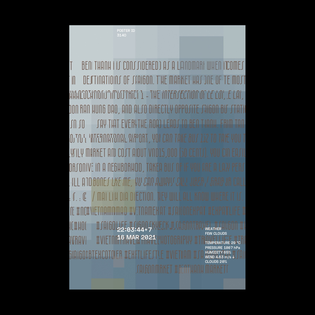
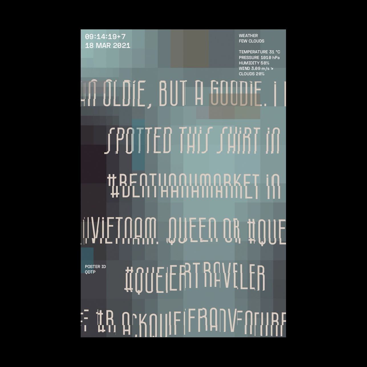
This installation looks into the seemingly static form and presence of typefaces as juxtaposed with the ever-changing surroundings and social contexts which they are intricately a part of. It also features original arrangements from sound artist Do Tan Si. The animated sounds of vehicles traversing the streets, characteristic of Saigon’s urban landscape, have been recorded and deconstructed to relay loops both familiar and diffuse. Auditory imageries are instantly recalled upon hearing these sounds, reminiscent of the buzz and frenzy one happens to encounter while driving in Saigon.
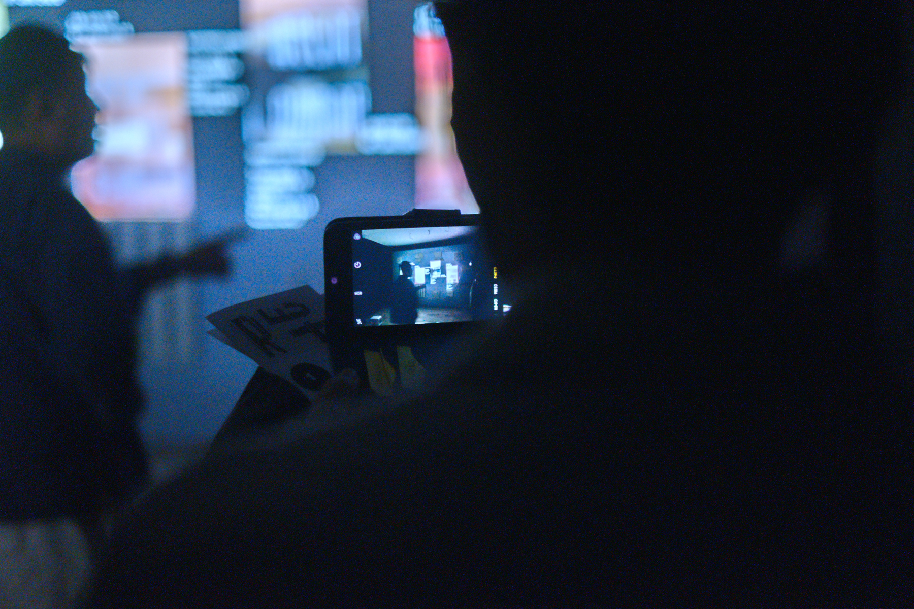
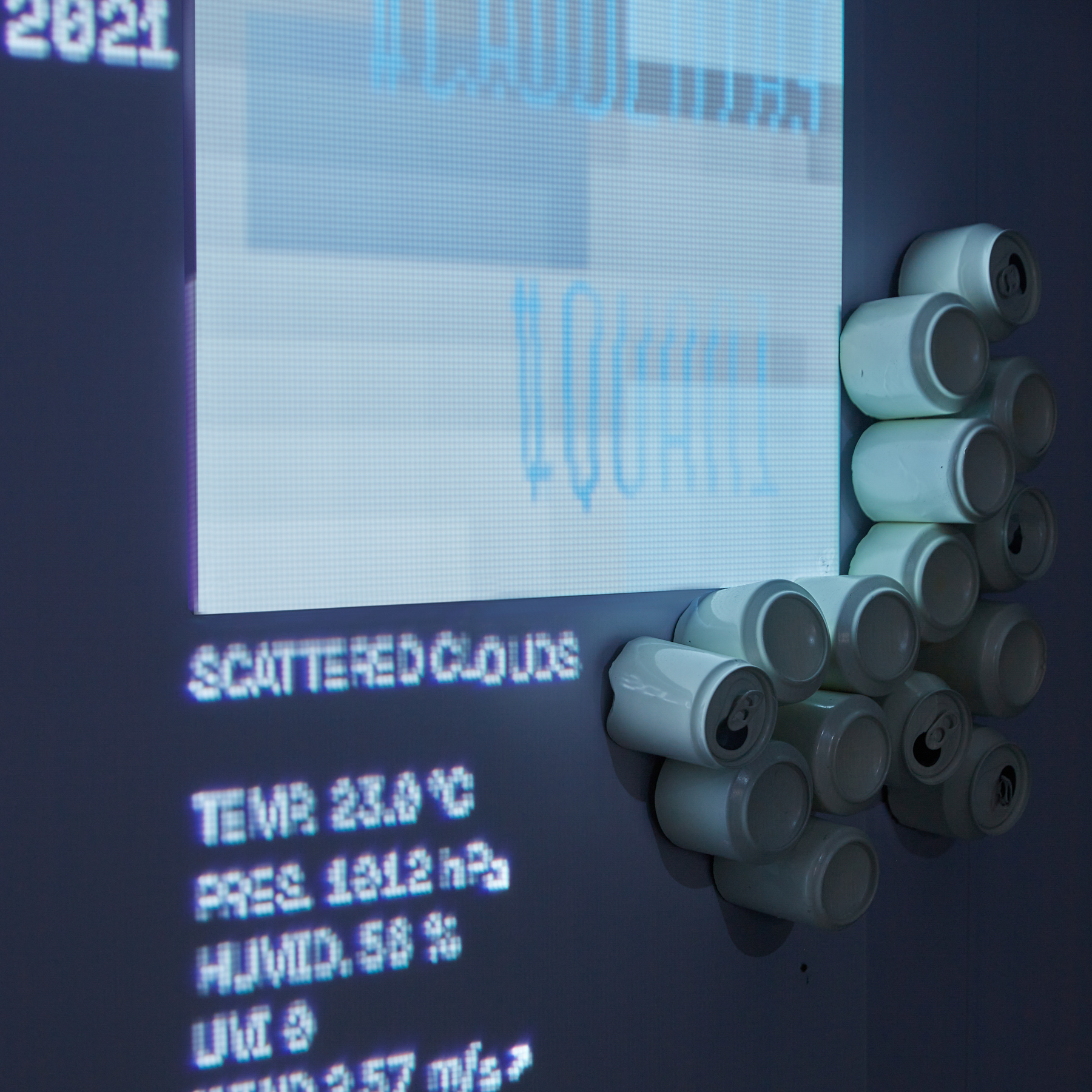
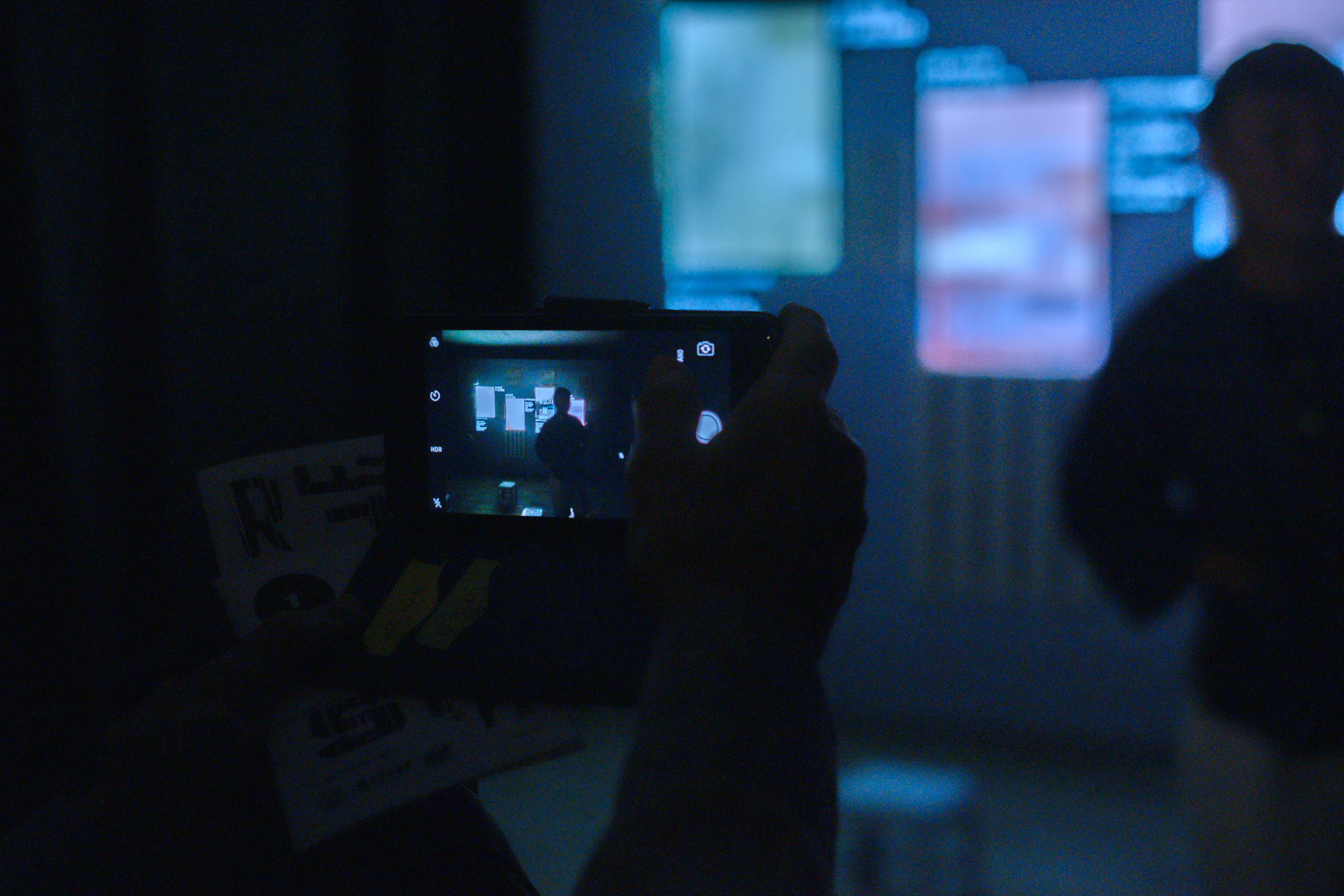
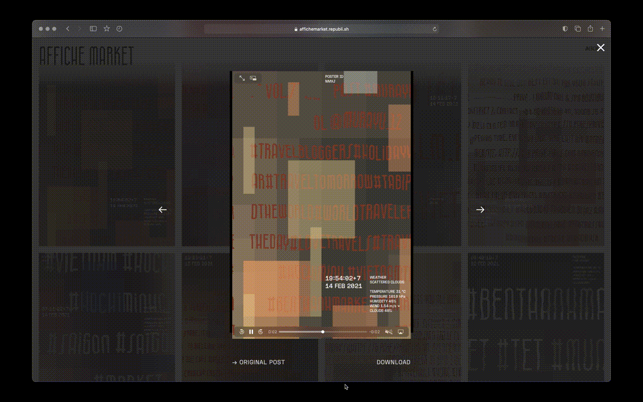
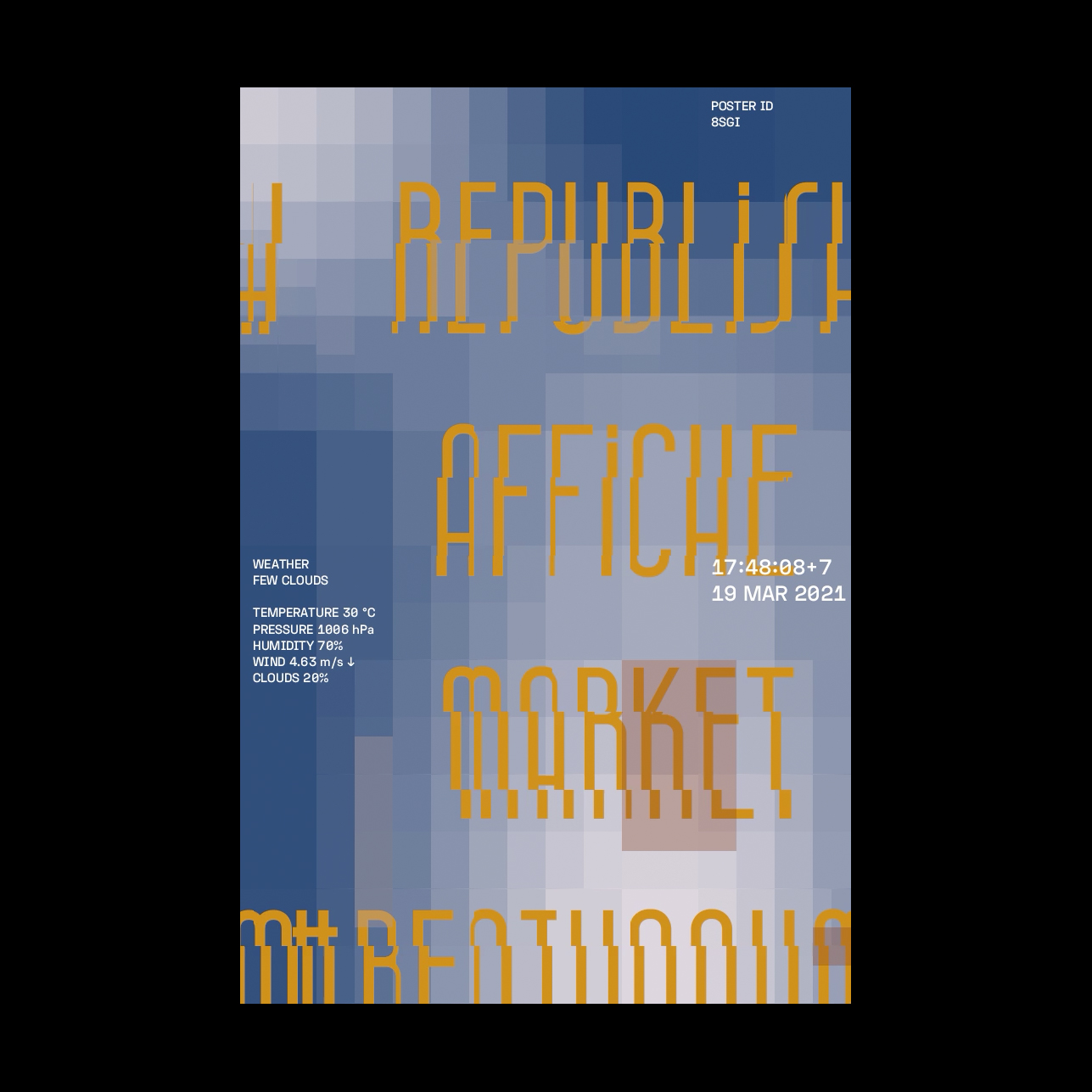
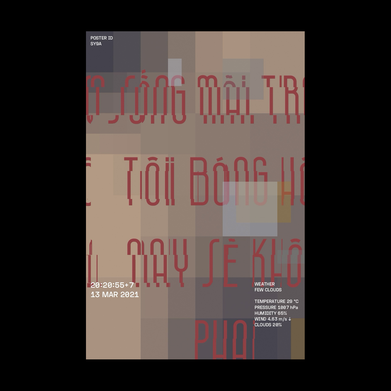
Behalf Studio has coded a real-time stream where photos posted on Instagram with the hashtags #chobenthanh, #benthanhmarket, and #benthanh are rendered into abstraction and layered with creative effects indicative of the climate measures in the spot they were taken. The posts’ original captions are converted into overlaying text styled in our “Westgate” (Cửa Tây) typeface, inspired by the vernacular lettering on the gates of Saigon’s Ben Thanh Market. Viewers can see the process in action by posting a picture with the aforementioned hashtags on their Instagram.After a few minutes of processing, the engine produces a typographic poster automatically uploads it to the Affiche Market website.
http://www.affichemarket.republi.sh/
http://www.affichemarket.republi.sh/
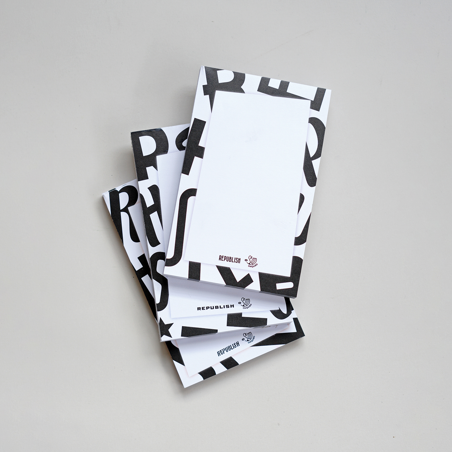
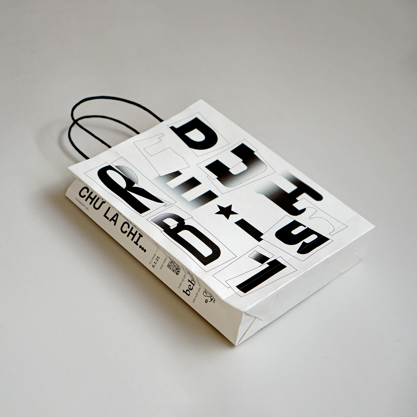
A range of merchandises were also being sold at the exhibition to raise funding for the project and help spreading the project's awareness. Merchandises are also our opportunity to collaborate with young local brands and businesses.


CREDITS
Creative Director
Giang Nguyen
Designers
Minh Nguyen
Linh Duong
Anh Nguyen
Phong Pham
Creative Coder
Minh Nguyen
Project Manager
Thu Doan
Producer
Ha Doan
Anh Ha
Giang Nguyen
Designers
Minh Nguyen
Linh Duong
Anh Nguyen
Phong Pham
Creative Coder
Minh Nguyen
Project Manager
Thu Doan
Producer
Ha Doan
Anh Ha
Location Partner
The Nutshell Saigon
Co-organizers
Simon Phan
Long Long Long
Minh Ngọc
Artwork Sponsor
RMIT University Vietnam
Artwork Collaborators
Hoài Minh Phương
Khô Mực Studio
Đỗ Tấn Sĩ
Event Collaborators
OhQuao Concept Store
Sữa Đá in The Nutshell
N&K Event Services
Quyên Hoàng
Artwork Photography
Lamoi Studio
Opening Event Photography
The Nutshell Saigon
The Nutshell Saigon
Co-organizers
Simon Phan
Long Long Long
Minh Ngọc
Artwork Sponsor
RMIT University Vietnam
Artwork Collaborators
Hoài Minh Phương
Khô Mực Studio
Đỗ Tấn Sĩ
Event Collaborators
OhQuao Concept Store
Sữa Đá in The Nutshell
N&K Event Services
Quyên Hoàng
Artwork Photography
Lamoi Studio
Opening Event Photography
The Nutshell Saigon