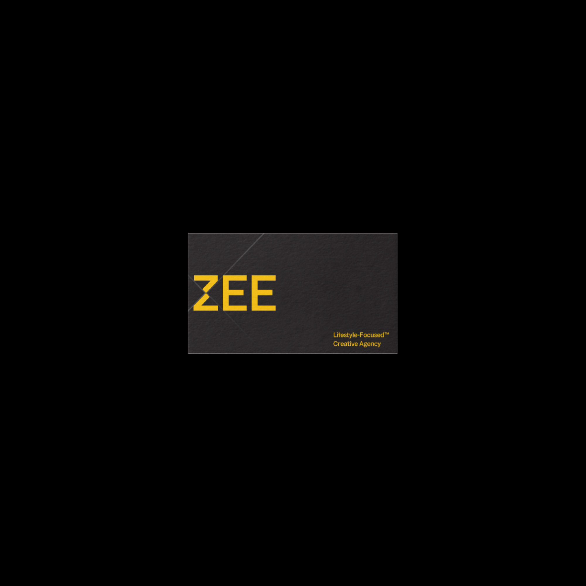
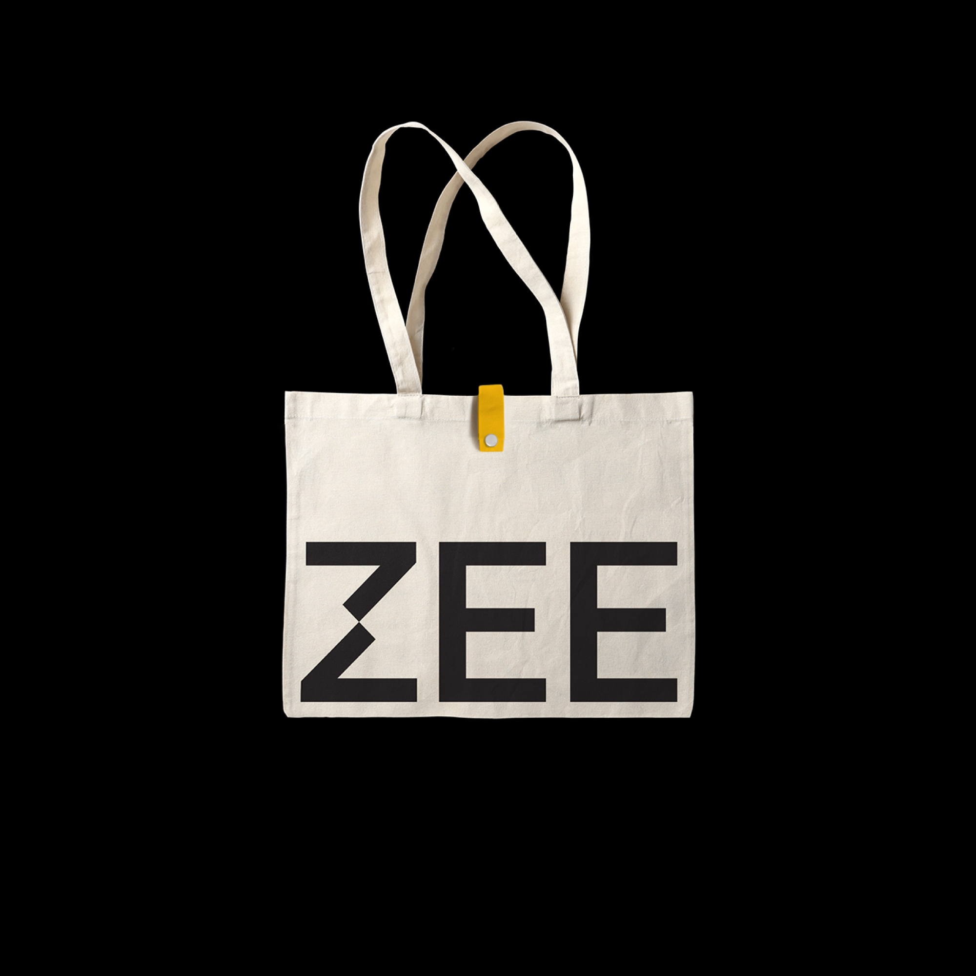
ZEE
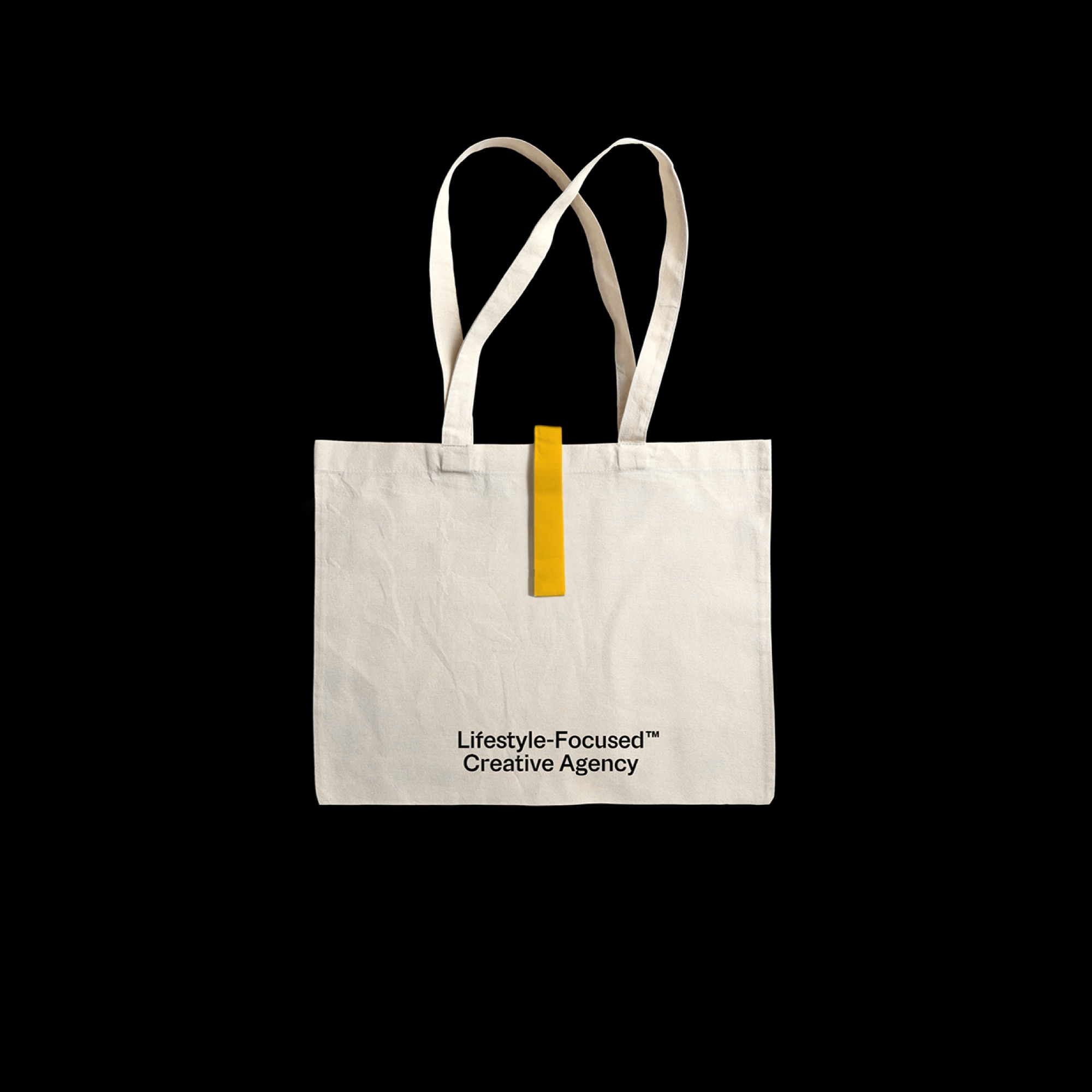
Based in Vietnam, ZEE is a full-stack creative agency that derives its unique approach from the essence of “Lifestyle”. After all, what defines a person’s character if not their lifestyle? This ethos is emphasized across all realms of ZEE’s practice through the proposed trademarked catchphrase “Lifestyle-Focused™” to be used across applications.

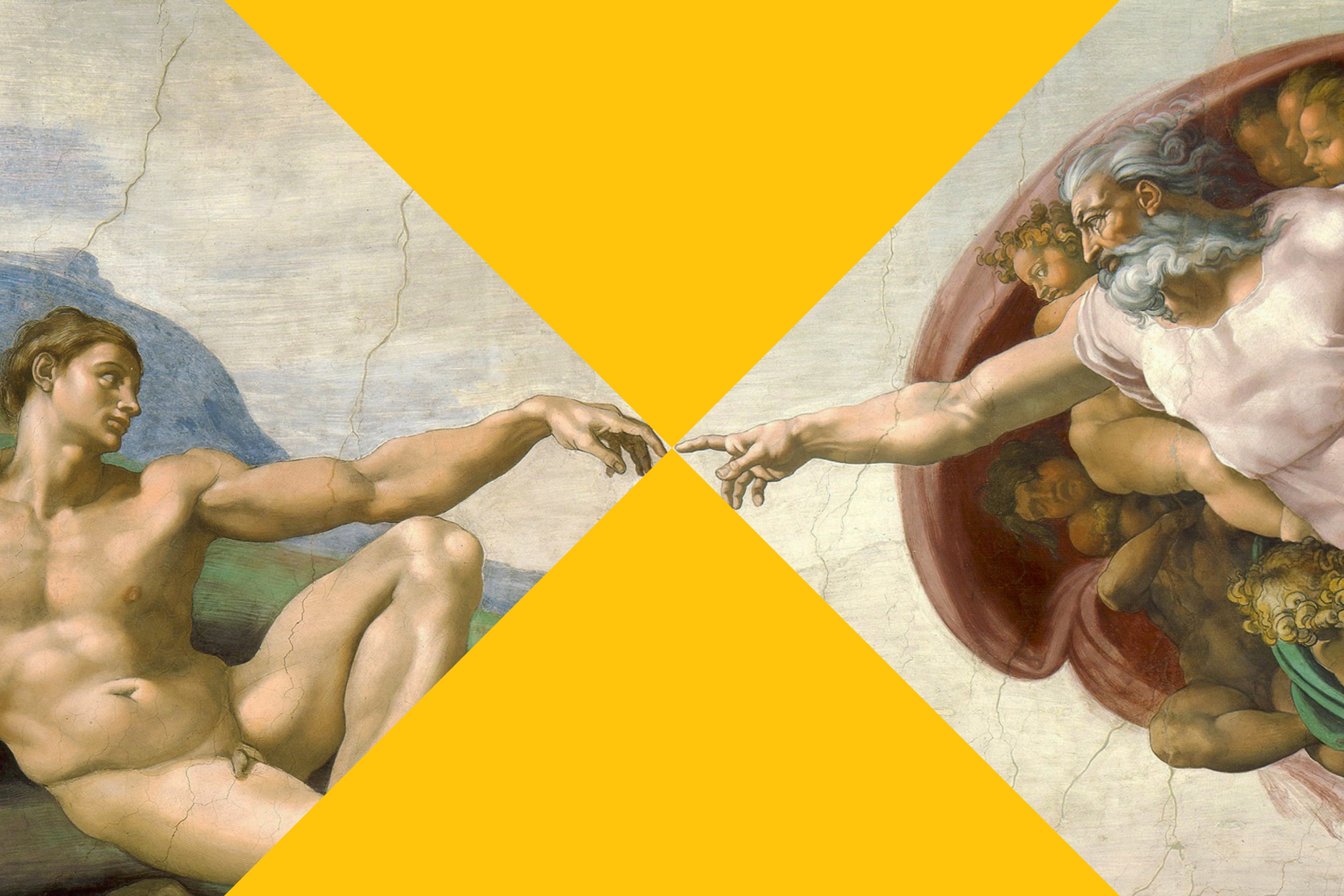
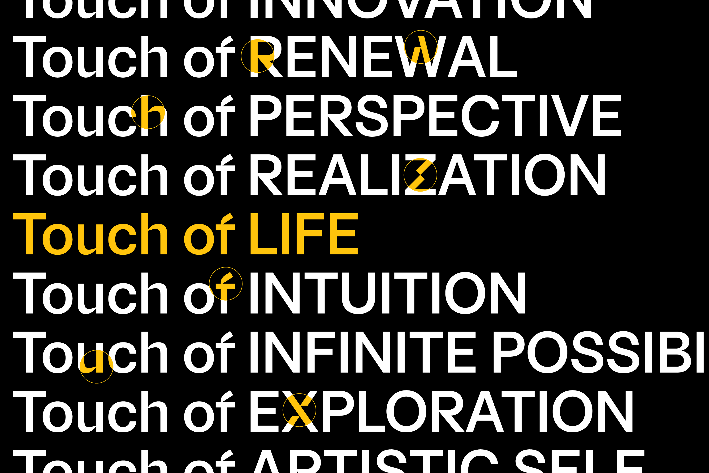
Our brand concept, inspired by “The Touch of Life,” signifies the touchpoints ZEE creates, uniting client brands with their audience’s lifestyle and igniting boundless creative possibilities.
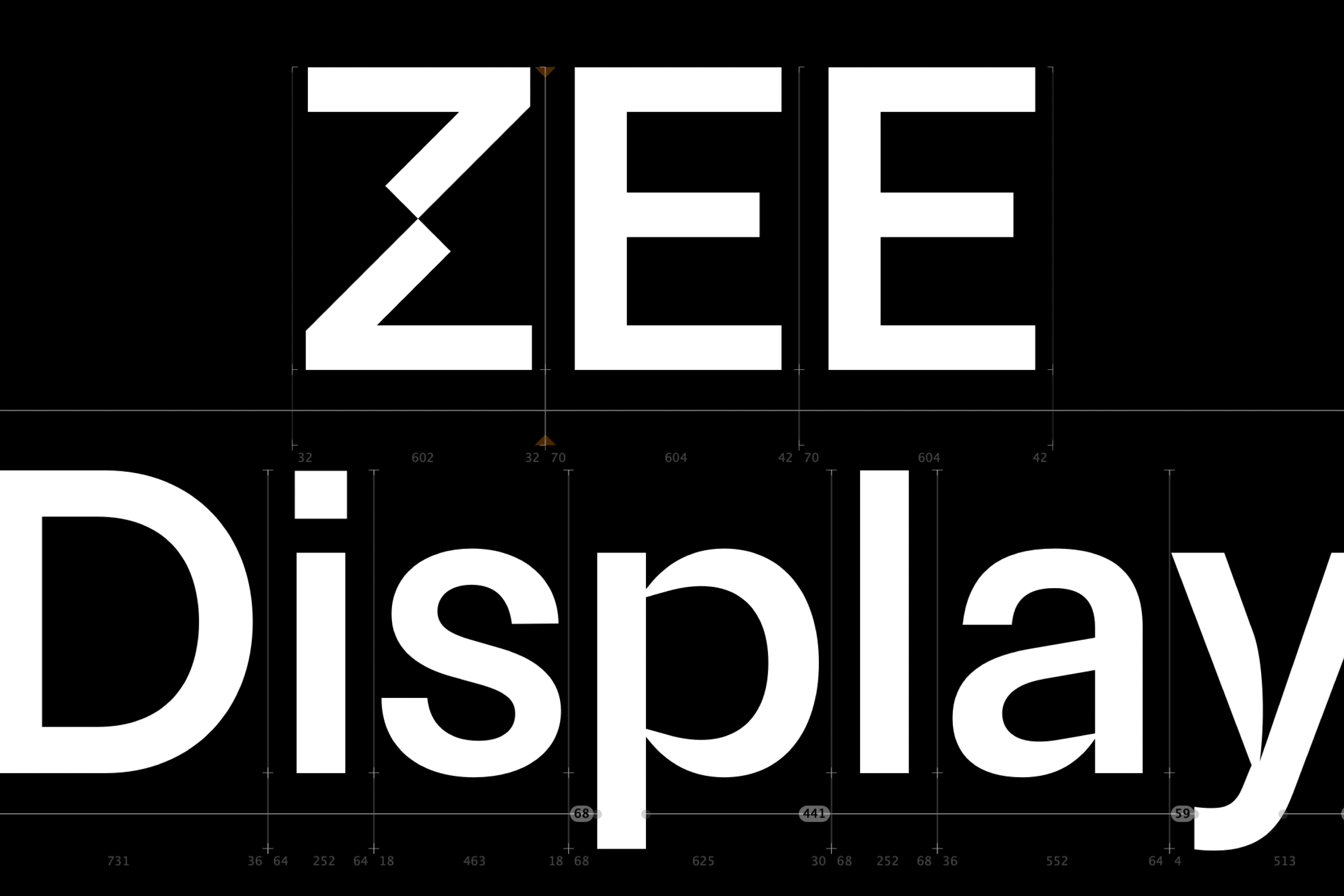
An essential aspect of this branding project was the creation of ZEE Display, a bespoke typeface designed exclusively by Behalf Studio. Balancing versatility with quirkiness, this typeface is crafted to accommodate both headline and body text usages. The unique and disruptive “ZEE’s Touch” has been intricately woven into selected glyphs, distinguishing this typeface as one-of-a-kind.


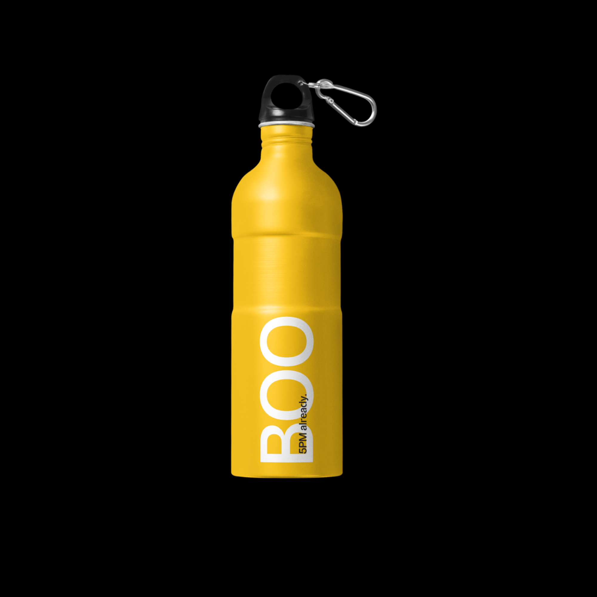
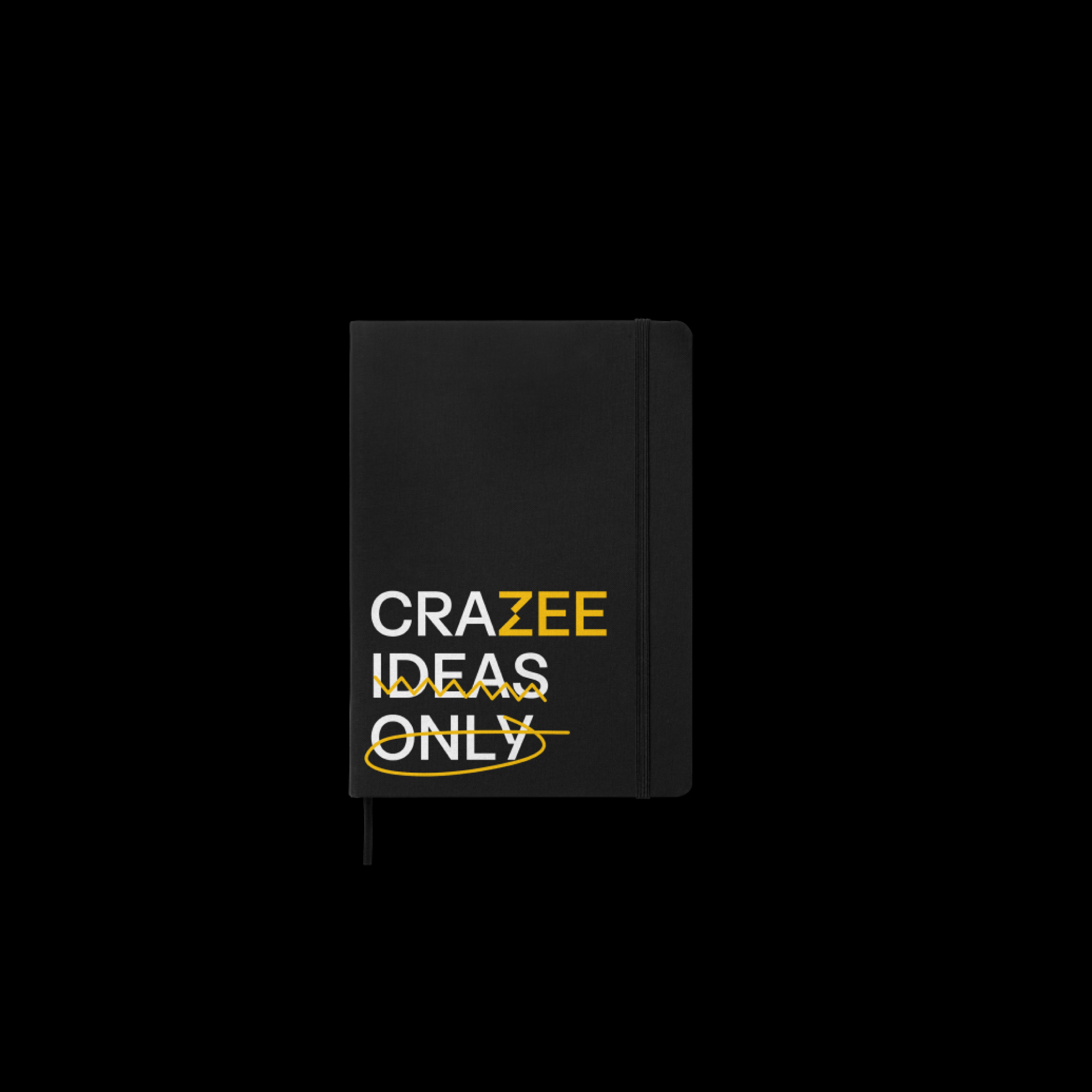
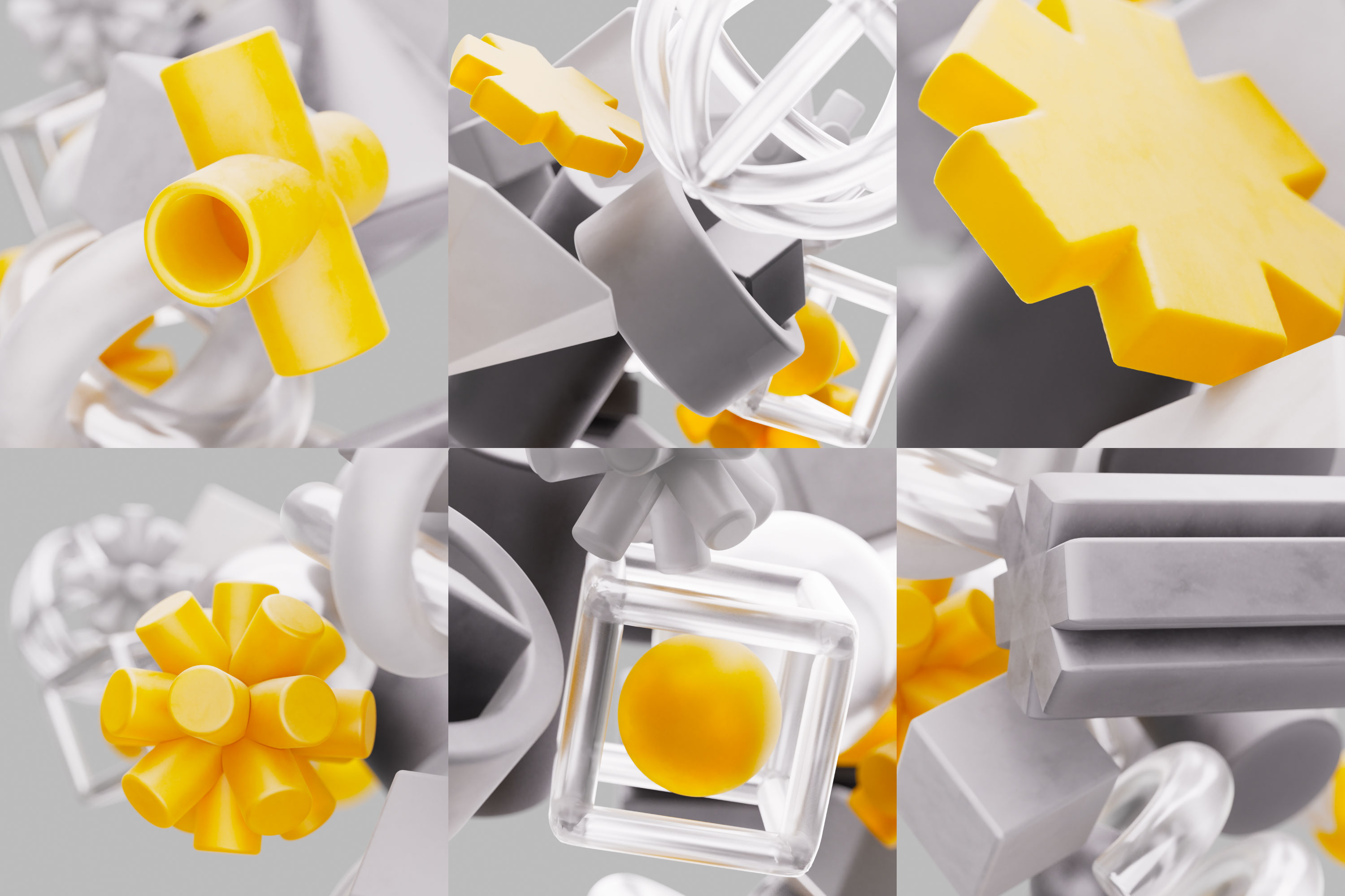
We also introduced a dynamic key visual system. Highly adaptable and adjustable, this system is designed to cater to different graphic matters, placement, and modes of expression. This degree of adaptability ensures that ZEE’s branding maintains visual consistency, while also showcasing its endless versatility and expressiveness as a creative firm.


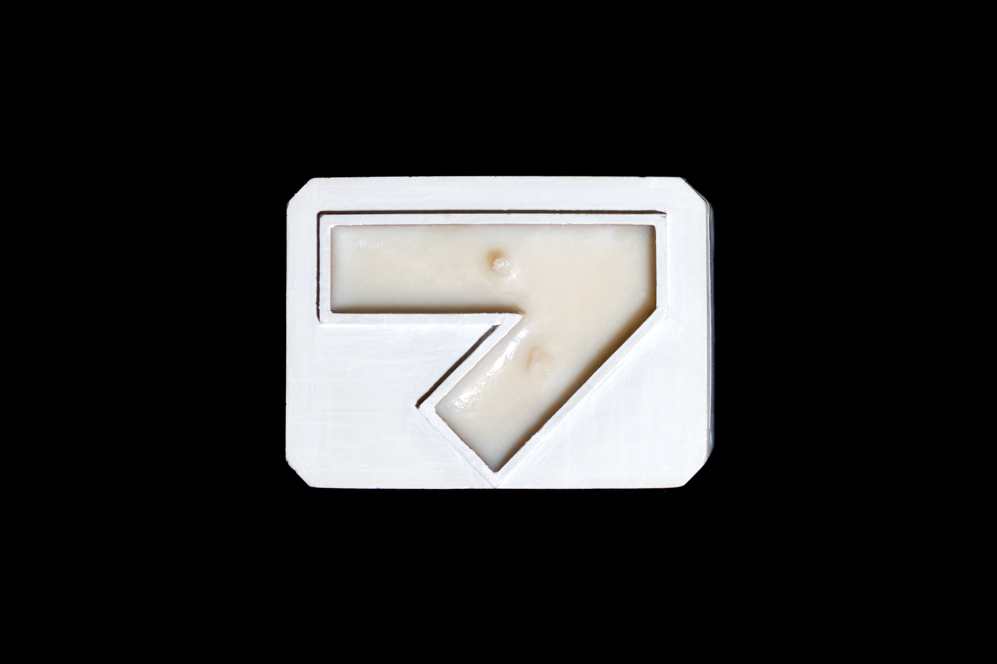
Marking the 7th Birthday of ZEE and the rollout of its new branding, we collaborated with local artisans to create a collection of seven uniquely scented candles, each inspired by a memorable milestone in ZEE’s journey.
Every individual candle comes with a bespoke holder, shaped to resemble half of ZEE’s monogram while resembling the number 7. A gift set consists of two randomly selected scents that, when “touched,” create the distinctive Z logotype. The set is completed with a premium packaging box.


We also created a graphical artwork that captures the agency’s creative approach and embodies the essence of the new branding. The visual composition comprises two halves: one in 2D, symbolizing the ideation process, and the other in 3D, representing the diverse creative executions that manifest in various forms and shapes. These elements converge at a single point, echoing the concept of “The Touch of Life” that we developed for the branding.

CREDITS
Creative Director
Giang Nguyen
Designers
Anh Nguyen
Phong Pham
Type Designer
Minh Nguyen
Project Manager
Lam Nong
Producer
Dung Nguyen
Content Writers
Giang Nguyen
Anh Nguyen
Giang Nguyen
Designers
Anh Nguyen
Phong Pham
Type Designer
Minh Nguyen
Project Manager
Lam Nong
Producer
Dung Nguyen
Content Writers
Giang Nguyen
Anh Nguyen
Animation (Brand Film)
Callimotion
3D Artist (Launch KV)
Tung Tỉnh
Web Development
BLANK
Callimotion
3D Artist (Launch KV)
Tung Tỉnh
Web Development
BLANK